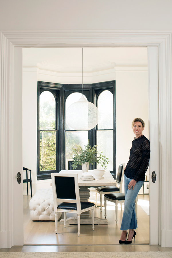
I have a particularly exciting home tour for you today – because it’s a tour of another room in our house! You’ve seen sneak peeks of this space (here & here) when my design was still in process, but over the past couple of months, I worked with One Kings Lane to finally bring the whole room together. The final result is exactly what I was looking for: a classic, timeless space with a modern touch.
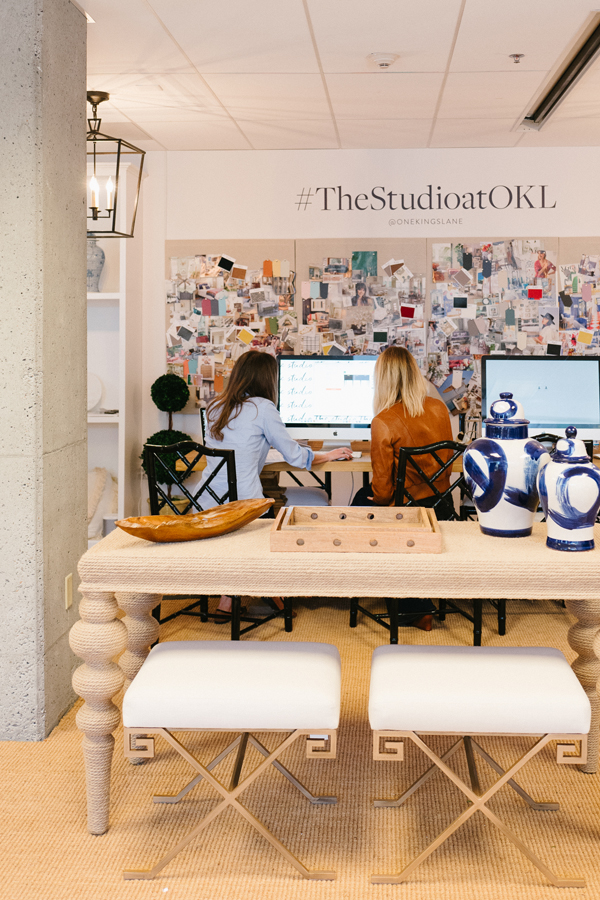
I’ve waited a long time to have a formal dining space. Years of apartment living and 4-person dinner parties definitely put a cramp in my entertaining style. Finally having a dining room gives me what I’ve longed for – a spaced dedicated to bringing people together over good food. I had a strong vision for the room and was thrilled to learn One Kings Lane had a Design Studio and in-house designers who could help bring my dream room to life. I met my designer, Chelsea Conrad at the San Francisco Studio at One Kings Lane. I came armed with my reams of pins – mostly of Parisian pre-war apartments – and Chelsea immediately got my vibe. Witha firm design plan crafted, I was able to set Chelsea out to source the perfect pieces – and she was certainly successful.
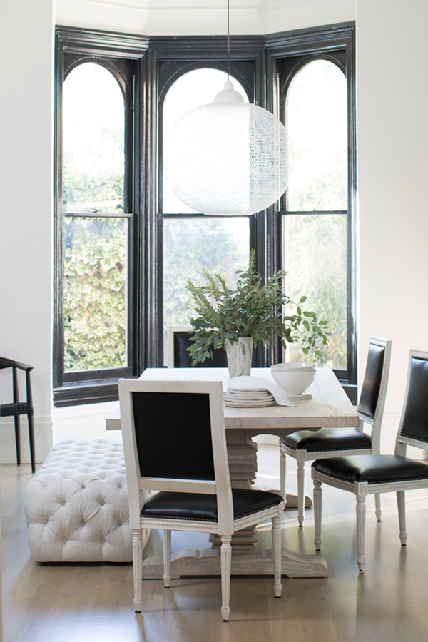
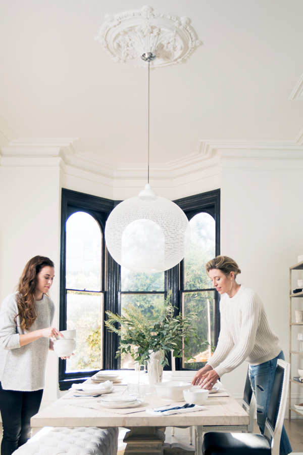
Her first find, and possibly my favorite piece in the whole room, is the dining table. It’s an eight-foot long beauty made of reclaimed pine in a soft ash stain. The lighter hue and ornate trestle base keep the table from looking too rustic.
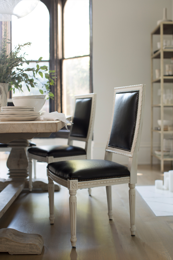
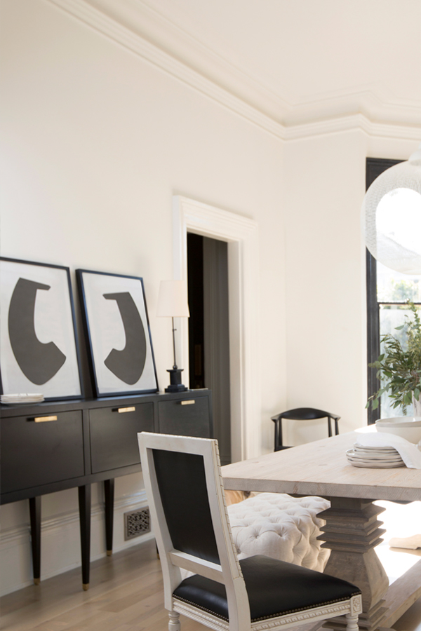
Such a stately table required equally substantial chairs. We tried a variety of options but many dining chairs felt dwarfed by the dining table’s heft. The traditional Louis XVI-style chairs, that were ultimately selected as our final winners, are stately with nice tall backs that help balance the room’s proportions. I also love how the chairs juxtapose classic detailing with chic black leather upholstery, adding an unexpected edge to the room. The black gives the chairs a glamorous update, while the weathered wood brings the formality back down a notch. And perhaps most importantly, they’re really comfortable.
The dining room is long, rectangular and relatively narrow, but there are little nooks on either side of the fireplace – perfect spots for having a little fun. To the left of the fireplace, I repurposed shelving I used in my old Apt34 studio to house a selection of my tableware collection. After years in this blogging business I have quite a lot. I intentionally kept the color palette neutral and muted. I didn’t want the bookcase to feel too busy. A few of art books and a vintage portrait add some additional texture. I’m also a sucker for a good occasional chair and the high-backed piece placed next to the shelving spoke to me immediately. Right now a shot of my husband holding our son when he was just days old takes prominence of place against the chair-back. I love leaning art rather than hanging it on the walls. It gives a space a more relaxed, undone feel. It also lets you play as your mood and decorating whims change!
When it comes to setting the table, my love of contrast continues. I like a mix of natural organic elements like woven placemats, bouquets of eucalyptus and natural edged dishes, all paired with my modern black flatware. Did you spy the marbleized vases, both on the table and on my bookshelf? Obsessed!
I wanted to bring in some bench seating to both soften the room and break up the formality of the table. I fell in love with the texture and rounded corners of the linen tufted bench immediately. By matching tones in different finishes you can create depth and interest in a room without having to bring in color. The bench also the perfect soft spot for my toddler to scramble up and sit at the table. He loves to “talk” with the rest of the adults.
One of the biggest challenges with this room is proportion. The 12-foot ceilings seem to dwarf things so finding furnishings with just the right scale became key. I firmly that is where you can benefit from outside design expertise the most. You can probably pull together color palettes or identify the style of things that you like with relative ease, but if the scale of your furnishing don’t work together, the whole room is thrown off. To help deal with our crazy ceiling height Chelsea chose a sideboard with tall, narrow legs and a surface that sits higher than the dining table. It draws the eye up. I also love that the sideboard has ample closed storage, allowing me to keep even more of my serveware in the dining room without adding clutter or breaking up all the clean lines. An étagère likewise adds lift to an empty corner.
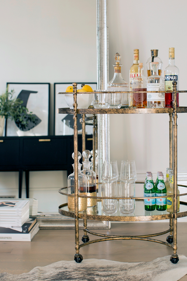
I firmly believe that you cannot entertain without a proper bar area. On the opposite side of the fireplace from my book shelf, we leaned a floor mirror (which adds depth to the narrow room and also bounces around even more light) and then placed a vintage-inspired – fully stocked bar cart. I love the mixed metallic finishes and the nod to the historic elements of the house.
All told, I couldn’t be happier with how this room came togehter. It’s now a place we not only gather for parties but for nightly family dinners and I often take up refuge for a power blogging session! Because the dining room is connected to the rest of the house it is a key part of the heart of our home.
For a peek at the dramatic before of this room CLICK HERE
For the entire feature on the design CLICK HERE
To shop this space on One Kings Lane CLICK HERE
And if you want to get a really personal view of how the space came together check out the One Kings Lane instagram account at 11:00 AM PST TODAY! I’m going to be doing a live tour of the room – eek!!
photography courtesy of one kings lane, photography of The Studio by OKL delbarr moradi
The post Reveal: My Dining Room Design with One Kings Lane appeared first on Apartment34.
from Apartment34
No comments:
Post a Comment