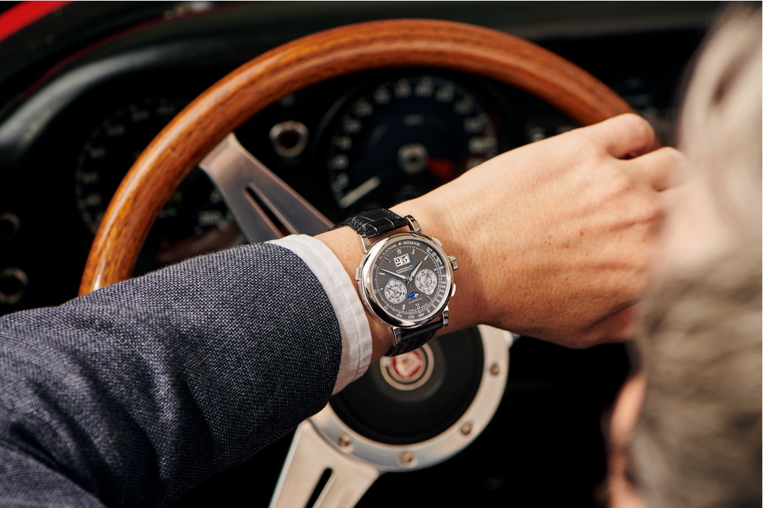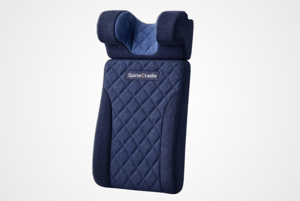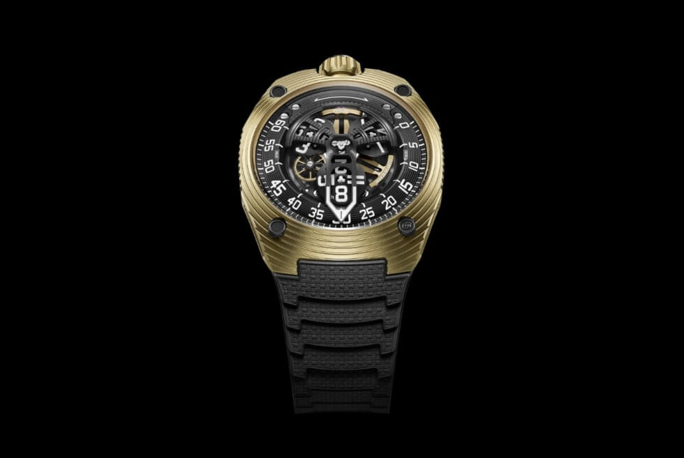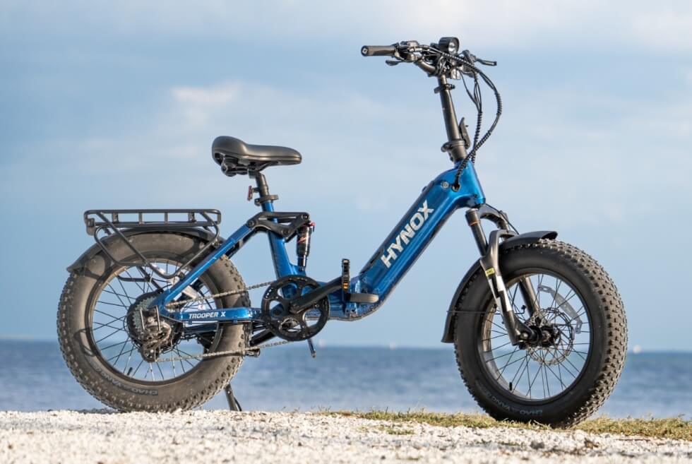
from Men's Gear


As in so many endeavours, timing is key in sports. A split second too late or too early and you do not make it. The more precisely one starts and ends, the better. Broadly speaking, this holds true in all sports, but it can be even more important when speed is essential, as it is in MotoGP, for example. Arguably, this is an efficient, if anodyne, way to start a major story in a watch specialty magazine. It relates this story to the cover quickly and it wastes no words telling you that we are going to discuss precision timekeeping. It is worth emphasizing the real-world challenges here from the start, as plainly as possible.
These true tests of chronometry unfold in real time, in often unforgiving circumstances. Whether under the blistering sun of world-class racing circuits; across exhausting mountain stages spanning thousands of kilometres; or beneath the glare of arena lights, tenths of a second dictate sporting destiny.
For Le Locle-based manufacture Tissot, founded in 1853, sports timekeeping is not an exercise in corporate alignment or logo placement. It represents the core of its industrial and technological identity, even if the marketing potential is somewhat more self-evident. While haute horlogerie purists obsess over hairspring breathing curves, lift angles, beat errors, and the optimal way to record and display elapsed times, Tissot operates on an extraordinary dual plane: developing complex engines on the wrist while orchestrating colossal, multi-sensor mobile timing ecosystems capable of parsing time to the thousandth of a second on the world stage.
From its iconic 25-year alliance with MotoGP to its five-decade deep romance with professional cycling and its high-tech revolutionising of the National Basketball Association (NBA), Tissot translates elite sporting pressure into horological substance that is woven into the fabric of the sport itself. This cover story provides a not-even-close-to-exhaustive deep dive into Tissot’s multifaceted sports universe, unravelling the mechanical inventiveness of novelties such as the openworked Tissot T-Race MotoGP 2026; the composite Tissot Pinarello; the versatile Tissot PR 100 Cycling duo; the tactical Tissot PR 100 Tour de France 2026; and the bold Tissot Supersport NBA Special Edition, with a special appearance by the Seastar WNBA Edition.


Top to bottom: Tissot PR 100 Tour de France 2026 40mm, Tissot PR 100 Cycling 40mm in stainless steel, Tissot T-Race MotoGP Automatic Chronograph 45mm in stainless steel and Tissot Pinarello 43mm in stainless steel and carbon.
Modern motorcycle Grand Prix racing is a discipline defined by extreme physical challenges and unyielding courage. One needs the latter when astride a propulsive machine capable of generating more than 300 horsepower that catapults its rider across asphalt ribbons at speeds exceeding 360 km/h. And one has to lean into the power, literally; riders take apexes at jaw-dropping 65-degree angles where elbow sliders kiss the kerbs. In this environment of sensory overload, human reaction times and mechanical tolerances converge at the absolute limit. Here, victory and heartbreak – or worse – are separated by fractions of a blink.
Tissot’s intimate connection with motorcycle racing is anchored in historical pedigree that long predates the modern world championship era. As early as 1953, the manufacture lent its timekeeping prowess to the Motorcycle Grand Prix of Bern. In the 1980s, Tissot deepened its roots by sponsoring pioneering Swiss 500cc Grand Prix racer Philippe Coulon, forging an authentic bond with two-wheeled culture that cemented the brand’s sporting credibility.
The turning point in modern motorsport timing arrived in 2001, when Tissot was appointed the Official Timekeeper of the FIM MotoGP World Championship. What began as a technical partnership quickly matured into one of modern watchmaking’s most enduring sporting alliances. This is one of the reasons we are so fond of Tissot and MotoGP here since 2001 is an important year for us too <WOW debuted that year, as World of Watches Singapore – Ed>.
In 2003, Tissot unveiled the very first official MotoGP timepiece, establishing an aesthetic and functional lineage that would birth the very successful T-Race MotoGP Limited Editions. The editor recalls reading a Keith Strandberg story in the aughts about Tissot executives discovering that MotoGP fans were wearing T-Race models to the races <Strandberg is today a watch industry executive himself, at another brand – Ed>. Far from a static collaboration where logo placements are the only things that might change, Tissot has continually evolved alongside the sport. In 2023, the brand embraced MotoGP’s dynamic new era with the creation of the Tissot Sprint – a fiercely contested Saturday dash that changed the Grand Prix weekend – while institutionalising the prestigious Tissot Pole Position Awards to celebrate qualifying mastery.

To comprehend Tissot’s role in MotoGP is to look beyond the watch as an accessory and understand the sheer technological magnitude of its timekeeping ecosystem at the races. At every Grand Prix stop – from the high-speed straights of Mugello to the undulating elevation changes of Portimão and the technical tight chicanes of Motegi – Tissot deploys an autonomous and ponderous mobile timing infrastructure. Now, Tissot typically stops right here with this sort of description, what with it not really having much to do with wristwatches and such. Our research directed us to some wonderful nuggets of information about motor racing in general that we just have to include here. You are welcome, racing nerds!
Every motorcycle on the grid is fitted with an ultra-lightweight, high-frequency transponder mounted within its chassis. As bikes rocket around the circuit, these transponders trigger high-precision induction loops and trackside optical sensors embedded at intermediate split points, sector boundaries, and pit entry/exit lanes. Slicing through the finish line at maximum velocity, high-speed digital scanning photo-finish cameras capture thousands of line-scans per second, establishing definitive results down to one-thousandth of a second (0.001s). This verified telemetry is fed instantaneously into race control, broadcasting graphics suites, and team pit walls, guaranteeing uncompromised data integrity under the most extreme vibrational and electromagnetic conditions.
Ok, the motor racing intermission is over, and we return you now to time on a personal scale. Of course, precision timing requires human champions who embody its spirit. In 2023, Tissot welcomed Italian sensation Enea Bastianini into its ambassador family. Renowned for his instinctive racing – some would call it racecraft – late-braking brilliance, and remarkable tyre management, Bastianini’s trajectory, from Moto3 podiums to claiming the 2020 Moto2 World Championship and multiple premier-class MotoGP victories, mirrors Tissot’s ethos of resilience and technological progress. Now racing with Red Bull KTM Tech3, Bastianini continues to prove that championship longevity requires an uncompromising commitment to micro-adjustments and relentless discipline.
The flagship horological manifestation of this partnership is the Tissot T-Race MotoGP 2026 45mm, which you can read more about in the Cover Watch segment, as usual. Right here though, we have thrown up another angle of human ingenuity to obsess about. This is, of course, the automatic calibre Valjoux A05.951…


At the mechanical core of the latest MotoGP collection lies the newly (last year) unveiled skeletonised chronograph Valjoux A05.951. Originating from the historic Vallée de Joux lineage – as indicated by its name – and developed specifically for the flagship T-Race MotoGP Automatic Chronograph, this movement represents a significant evolutionary step over the existing A05.231, according to Tissot.
Engineered with a high-frequency balance beating at 4 Hz or 28,800 vibrations per hour, the A05.951 appears to be very closely related to calibre A05.231, right down to using a Nivachron balance spring and having a power reserve of 68 hours. Furthermore, both calibres use free-sprung balances with variable inertia studs, so no Etachron (or similar) regulators. Interestingly, the new calibre uses 28 jewels, while the older one had one more, though this is superficial, we think. The shock absorber is different, with calibre A05.951 using ETA’s proprietary Nivachoc A; A05.231 used the standard Nivachoc. For reference, these shock absorbers guard the balance staff against a variety of lateral and vertical perturbations.
From a casual visual inspection (at shoot via the editor) and from pictures, the two calibres are a close match, with the skeletonisation-visible dial side being the main difference. The new calibre retains a unidirectional automatic winding system (with high-grade ball bearings). It also retains the reliable cam-lever chronograph architecture with dial-side indications including a 30-minute register at 3 o’clock, a 12-hour register at 6 o’clock, and running small seconds at 9 o’clock. These are all exposed through a striking openworked architecture. As noted in our own story about skeletonising and openworking, the style seen in this version of the T-Race MotoGP is très contemporary and very much in the openworked style.
If motorsport is an exercise in aggressive acceleration and braking, road cycling is the ultimate test of physical endurance, tactical nuance, and psychological fortitude. Here, racers and their bikes form one superhuman unit, but we are getting ahead of ourselves. Spanning gruelling three-week Grand Tours through torrential rain, alpine snow, and searing summer heatwaves, professional cycling demands an extraordinary synchronization of human power and mechanical efficiency.
Tissot’s association with competitive cycling spans more than half a century. In the 1960s, the brand actively supported foundational cycling events, awarding precision timepieces to victors at the Mellaha Circuit in Tripoli (1964) and the demanding Six-Day Races in Madrid (1964–1966). By the 1980s, Tissot had ascended to the pinnacle of race timing, serving as the Official Timekeeper for both the iconic Tour de France and the prestigious Grand Prix des Nations time trials.
In 1995, Tissot cemented its institutional leadership in the sport by forging an enduring partnership with cycling’s global governing body, the Union Cycliste Internationale (UCI). As UCI’s Official Timekeeper, Tissot provides timing and scoring for the entire spectrum of world championships: Road, Track, Mountain Bike (MTB), and BMX, as well as the UCI Track Cycling Nations Cup. In 2016, Tissot renewed its historic bonds as Official Timekeeper of the Tour de France and La Vuelta a España, while actively supporting the Tour de Suisse.
Timing a modern cycling Grand Tour represents one of sports technology’s most complex logistical challenges. Over 21 stages spanning more than 3,500 kilometres, Tissot’s timing specialists deploy satellite-synchronized timing transponders affixed beneath the saddles of nearly 200 riders. These transponders interact with trackside antennas and optical timing traps positioned at intermediate sprint points, categorized mountain summits, and finish lines.
When a bunched peloton thunders towards the finish line at 70 km/h during a chaotic mass sprint, the human eye cannot untangle the physical overlap of front tyres. Tissot’s high-speed line-scan finish cameras record up to 10,000 frames per second directly across the white line, generating a continuous photofinish composite that allows race commissaires to distinguish gaps as infinitesimal as one-tenth of a millimetre.
This technical rigor is embodied on the road by Slovenian cycling maestro and Tissot Ambassador Primož Roglič. A multiple-time Grand Tour champion and Olympic gold medallist, Roglič’s transition from competitive ski jumping to cycling royalty epitomises the relentless calculation, strategic patience, and grit that characterize both elite cycling and fine Swiss chronometry.

The pinnacle of Tissot’s adventure in cycling is represented by the Pinarello 43mm Special Edition (Ref. T162.408.97.061.00). Born from an authentic collaboration between the watchmaker and legendary Italian bicycle constructor Pinarello – builders of bikes that have carried champions to 15 Tour de France victories – this timepiece translates high-performance carbon engineering into wristwear.
The 43.14mm case is sculpted from a lightweight, ultra-dense forged carbon composite combined with 316L stainless steel and capped by a scratch-proof black ceramic bezel. Its striking asymmetrical silhouette repositions the winding crown to 10 o’clock, drawing direct inspiration from the aerodynamic fork flap design of Pinarello’s elite race frames.
The textured anthracite-grey dial features grooved, facetted hands and black-nickelled baton indices illuminated by Superluminova. In a sublime tip of the hat to Treviso engineering, the central seconds hand is formed into Pinarello’s distinctive “P” monogram, finished in the brand’s iconic Borealis iridescent colourway.
Beating within is the COSC-certified chronometer Powermatic 80 calibre, boasting the Nivachron hairspring (see above) and a class-leading 80-hour power reserve. The watch itself is water-resistant to 100 metres. Presented in an exclusive collector’s presentation case, it features an interchangeable strap system including an HNBR technical rubber strap and handcrafted Italian leather band.

Recognizing that cycling passion extends from the professional peloton to weekend club riders and urban commuters, Tissot developed the PR 100 Cycling collection in two distinct case sizes: 40mm (Ref. T150.410.17.037.00) and 34mm (Ref. T150.210.17.037.00).
Housed in slim, ergonomic 316L stainless steel cases measuring an ultra-comfortable 8.25mm thick, these timepieces are engineered for barely-there daily wear. Both models feature distinct thematic embellishments: intricate cyclist motifs engraved across the brushed steel bezel and screw-down caseback. The textured matte-grey dial is framed by clean Arabic numerals and baton indices coated in Superluminova, complemented by a discreet date aperture at 3 o’clock. Powered by a high-precision Swiss quartz three-hand movement with an End-of-Life (EOL) battery indicator, the PR 100 Cycling is paired with a stylish two-tone bicolour white-and-beige / grey textile strap equipped with a quick-release mechanism and 100-metre water resistance.

For dedicated followers of La Grande Boucle, the Tissot PR 100 Tour de France 2026 40mm (Ref. T150.417.37.057.00) delivers specialized race timing in a stealthy, high-contrast package. Encased in 40mm of 316L stainless steel treated with an asphalt-black PVD coating, this 11.26mm thick chronograph captures the electric energy of the world’s greatest bike race.
Powered by the robust Swiss ETA G10.212 quartz chronograph movement, the timepiece provides split-second timing capabilities including central 60-second chronograph timing, a 30-minute counter, a 1/10th-of-a-second counter, and ADD/ SPLIT intermediate timing functions. The central chronograph seconds hand features a distinctive yellow bicycle counterbalance that sweeps across the dark textured dial, referencing the legendary maillot jaune. Complete with a scratch-resistant sapphire crystal and interchangeable black textile and rubber straps, it serves as the ultimate companion for cycling enthusiasts.

Basketball is a game governed by rhythm, explosive acceleration, and the relentless countdown of the clock. In modern professional basketball, a single possession can alter a franchise’s destiny. Every inbound pass, defensive rotation, and buzzer-beating three-pointer is dictated by a strict 24-second boundary.
In 2015, Tissot made sports marketing and horological history by becoming the first Official Timekeeper of the National Basketball Association (NBA), the Women’s National Basketball Association (WNBA), and the NBA G League. In January 2025, during the NBA Paris Games at the Accor Arena, Tissot CEO Sylvain Dolla and NBA leadership announced a landmark multiyear extension of this global partnership, securing Tissot as the Presenting Partner of NBA Global Games in Europe for the next 10 years.
This commitment is evident across marquee international fixtures, including the NBA Berlin Game 2026 at the Uber Arena and the NBA London Game 2026 at The O2, featuring the Orlando Magic and Memphis Grizzlies. The global expansion continues into 2027 with scheduled stops in Manchester and Paris. Aligning with these European milestones, Tissot officially inducted hometown Berlin sensations and Orlando Magic stars Moritz and Franz Wagner into its ambassador roster, joining established luminaries such as eight-time NBA All-Star Damian “Dame Time” Lillard, NBA legend Tony Parker, and 2024 WNBA Champion Sabrina Ionescu.
Perhaps no sporting timing device is more visible and important to millions of global viewers than the shot clock positioned directly atop the backboard. Debuting across all NBA and WNBA arenas for the 2025–26 NBA and 2026 WNBA seasons, Tissot and the NBA co-developed a ground-up redesign of this iconic apparatus.

Drawing aesthetic inspiration from traditional circular horological instruments, the new shot clock introduces the world’s first round shot clock architecture. Constructed with a streamlined aluminium chassis that is 20% lighter than previous generations, the unit facilitates safer, more rapid installation and modular arena maintenance. Technically, the clock incorporates full RGB LED light strips capable of dynamic multi-colour illumination, including the seamless integration of the green Coach’s Challenge visual indicator. Powered by an upgraded high-throughput signalling distribution network, the system guarantees instantaneous latency-free synchronisation with arena horns, whistle audio-sensors, and the NBA Replay Center in Secaucus, New Jersey, providing referees and arena operating staff with unprecedented operational speed.
Capturing the vibrant urban aesthetic and athletic pulse of the hardwood, the Tissot Supersport NBA Special Edition 45.5mm brings courtside DNA to the wrist. Its commanding 45.5mm case (11.92mm thick) is crafted from 316L stainless steel finished in a matte black PVD coating, offering 100 metres of water-resistance.

The watch’s visual architecture is rich in subtle basketball cues. The black aluminium bezel ring integrates a specialized graduation paying homage to the 24-second shot clock rule, punctuated by subtle red and blue accents nodding to the league’s colours. The dial features a gradient from dark anthracite to black, stamped with a distinct pebble-dot texture that recreates the surface and tactile feel of an official basketball. Applied Arabic numeral indices are styled directly after team uniform typography, while the vibrant central chronograph seconds hand is counterbalanced by the iconic NBA silhouette logo.
The caseback holds a distinctive tribute: an intricate engraving of the NBA logo encircled by the names of all 30 NBA franchises, organized geographically by latitude and divided by conference; the Western Conference teams are aligned on the left flank, with the Eastern Conference teams on the right. Powered by a Swiss ETA quartz chronograph calibre with 1/10th-second precision, the watch is fitted with a bi-material strap combining leather, rubber, and synthetic materials finished with contrast stitching, echoing the grip of the ball.
Tissot’s basketball commitment extends powerfully into women’s sports through the Tissot Seastar Wilson® WNBA collection in 40mm Powermatic 80 and Quartz variants. Co-created with Wilson, the official ball manufacturer of the WNBA, these timepieces feature WNBA signature orange and white accents, a uni-directional rotating bezel with a 24-second shot clock marker, and interchangeable quick-release straps fabricated directly from authentic Wilson composite leather WNBA basketballs.

In an industry often preoccupied with value-to-RRP ratios and inaccessible exclusivity, Tissot stands out as an icon of positivity. Through its commanding presence across MotoGP, cycling’s Grand Tours, and the NBA, the Le Locle manufacture bridges the divide between cutting-edge industrial technology and mechanical watchmaking industrial artistry.
Whether engineering an openworked Valjoux A05.951 chronograph beating on the wrist of an adrenaline junkie, forging aerodynamic carbon watchcases with Pinarello, or synchronising a fleet of multi-sensor transponders across continental race tracks, Tissot proves that true timekeeping legitimacy is earned not in marketing boardrooms, but on the field of play. (Recall here that although this story is not about the PRX, this model was and is a success that was made without a specific marketing mandate, other than ‘make a good watch,’ if anything.) In capturing the fleeting beauty of sports’ most decisive seconds, Tissot remains the enduring storyteller of every champion’s journey.
Photography by Ching@greenplasticsoldiers
Art Direction & Styling by Audrey Chan
Other images courtesy of Tissot
This story was first seen as part of the WOW #86 Autumn 2026 issue.
For more on the latest in luxury watch reads, click here.
The post Where Every Second Matters: Tissot’s Journey Through the World of Elite Sports Timing appeared first on LUXUO.


For a gemstone that comes in an extraordinary range of colors, sapphire has spent a surprisingly long time being defined by just one.
Blue remains its best-known expression, carrying centuries of recognition and some of fine jewelry’s strongest associations. Sapphire belongs to the mineral species corundum, and the Gemological Institute of America notes that fancy sapphires occur in colors including pink, orange, yellow, green, purple and violet, along with intermediate hues.
That leaves jewelers with a harder creative question: how do you persuade collectors to look beyond conventional blue without making every alternative feel like a passing colour trend? Piranesi’s assortment suggests one answer: don’t reinvent the jewelry every time the color changes.
Across Fiore, Dome, Wave Heart and Mosaique designs, the house returns to recognizable forms while moving through dramatically different gemstone palettes. Fiore centers on four-petal flowers set with colored stones, while Dome takes a more sculptural approach through rounded forms and concentrated fields of color.
The result is a useful reversal of the usual formula. Color provides the surprise; design provides the continuity. Piranesi does not need another shade merely for novelty. It needs each one to feel as though it belongs.

Blue has an advantage that yellow, pink and orange do not: almost nobody needs to be introduced to it.
According to GIA, blue is sapphire’s best-known color, and that familiarity gives jewelers an immediate visual shorthand. But it can also narrow expectations. When collectors already have a fixed idea of what a sapphire ring, necklace or pair of earrings should look like, other colors risk being treated as exceptions rather than equally serious choices.
Piranesi’s blue assortment shows how much can happen within that familiar starting point. Its collection includes rings, earrings, necklaces, pendants and bracelets, with blue stones appearing across designs including Fiore, Dome, Mosaique, Vendome and Wave Heart. The pieces are crafted in 18K gold, with diamonds incorporated into many of the designs.
The more interesting question is not how Piranesi replaces blue. There is no reason to. It is whether the same visual language remains convincing when the gemstone changes color. That is where the wider collection becomes more interesting.
Yellow changes the mood of sapphire almost immediately. Where deep blue can feel formal, cool and traditional, yellow introduces warmth and brightness. GIA recognizes yellow as an established fancy-sapphire color, with stones ranging from lighter shades through orangy yellow and varying considerably in tone and saturation.
That gives Yellow Sapphire Jewelry a distinctive role within Piranesi’s broader color story. The important point is not simply that the house works with yellow stones. It is where those stones appear.
Piranesi uses yellow across recognizable designs including Fiore pieces, while its broader assortment carries the color through familiar house motifs rather than isolating it as an occasional novelty. The Fiore Small Flower Bracelet, for example, uses the color within a design language already associated with the house.

That repetition changes the buying decision. A collector can respond to the silhouette first and then decide which gemstone color feels most personal. Yellow does not need to behave like blue to be convincing. Its appeal comes from doing almost the opposite: bringing sunlight and warmth to a gemstone many people instinctively imagine in cooler tones.
Pink comes with a different design problem. Handled too predictably, it can drift toward sweetness. A stronger piece has to allow the color to retain its softness without making the entire design feel fragile. This is where Pink Sapphire Jewelry becomes particularly revealing.

Consider two very different Piranesi rings. The Dome Ring uses approximately 10.50 carats of deep-pink sapphires in 18K rose and black gold, giving the color a substantial, sculptural setting. The Fiore Double Flower Ring takes a lighter approach, pairing approximately 1.60 carats of pink sapphires with approximately 0.80 carats of diamonds in an open floral design.
The same broad color family produces two entirely different impressions. One is bold and architectural. The other is airy and floral.
That contrast matters because it prevents pink from being reduced to a single aesthetic. The design determines whether the color feels romantic, dramatic, playful or refined. For a collector seeking individuality, that flexibility is more persuasive than simply presenting pink as an alternative to blue.
Orange presents almost the reverse challenge. It does not suffer from overfamiliarity. It suffers from not being familiar enough.
That unfamiliarity is also what gives the color its impact. GIA recognizes orange among the fancy-sapphire colors, with stones ranging from yellowish orange to reddish orange. It separately identifies padparadscha as a rare pink-and-orange variety, so the term should not be applied to an ordinary orange sapphire unless the stone meets the appropriate color criteria.
Within Piranesi’s Orange Sapphire Jewelry collection, the color appears across rings, earrings, necklaces, pendants and bracelets.

One of the clearest examples is the Dome Bangle. Piranesi lists the piece with approximately 23.50 carats of round orange sapphires set in 18K rose gold.
The scale matters, but so does the familiarity of the design. Because Dome already functions as a recognizable Piranesi form, the unusual color does not have to carry the entire creative idea. The silhouette gives it structure.
That may be one of the simplest ways to make an unexpected gemstone color feel serious rather than experimental. Orange does not have to imitate blue to earn a place in a fine-jewelry collection. It only has to feel deliberate.
The strongest argument for Piranesi’s multicolor approach is not the number of shades it offers. It is how consistently those shades inhabit the same design world.
Dome creates volume through closely set colored stones. Fiore turns its four-petal flower into a recurring motif. Mosaique uses round and oval colored sapphires in organic arrangements, while Wave Heart gives the palette a more romantic silhouette.
Because those forms recur across colors, collectors are not being asked to understand an entirely different aesthetic every time the gemstone changes. The gemstone changes. The handwriting remains recognisable.

There is heritage behind that vocabulary as well. Piranesi states that the company moved its headquarters from Milan to New York in 1976, beginning its New York chapter at Rockefeller Plaza, and today operates from Fifth Avenue. The company also describes itself as a multigenerational family house working with precious gemstones and metals.
History alone does not make Piranesi a leader in colored sapphires, just as offering a wide assortment does not automatically earn a luxury house a crown.
What makes the case more interesting is the combination: heritage, 18K gold craftsmanship and a repeatable contemporary design language capable of giving distinctly different colors a recognizable identity.
Blue does not need to lose its status for sapphire’s other colors to gain one. That is the more compelling opportunity visible in Piranesi’s collection.
Blue supplies the familiarity. Yellow introduces warmth. Pink moves between softness and strength. Orange provides the surprise. What connects them is not a claim that one shade has replaced another, but a design vocabulary capable of holding all four.

For collectors, that changes the question. Choosing from Piranesi’s broader Sapphire Jewelry collection does not have to begin and end with the assumption that sapphire means blue. It can start with the shape of a Dome ring, the floral lines of Fiore, the organic arrangement of Mosaique or simply the color that feels most personal.
The most credible version of the “king of sapphire” argument is therefore not a literal crown. It is the ability to make blue, yellow, pink and orange feel unmistakably part of the same design world.
Piranesi does not need blue’s reign to end for that argument to work. The stronger case is visible in the pieces themselves: distinctly different colors connected by a design language that remains recognisable when the gemstone changes. In luxury, that kind of recognition can be far more valuable than a title.
For more on the latest in luxury jewellery reads, click here.
The post From Yellow to Pink and Orange: How Piranesi Is Giving Sapphire Jewellery a New Look appeared first on LUXUO.

Luxury interiors are changing. LUXUO gets advice from interior designers and material specialists on how to elevate a space in line with the latest design direction, where better surfaces, warmer materials, considered lighting, and intelligent storage are taking precedence over decoration for decoration’s sake.
The shift is visible in homes, hotels and restaurants. Stark white rooms are giving way to warmer palettes. Natural stone is returning with more visible veining and softer finishes. Darker timber, tactile fabrics and aged metals are bringing character into spaces that once relied on polished surfaces and perfect symmetry. Even cabinetry is being reconsidered, with storage increasingly treated as part of the architecture rather than a collection of boxes.
The change reflects a wider appetite for interiors that feel more personal and less manufactured. Current design coverage points towards material contrast, craftsmanship and signs of use, with the most successful spaces balancing restraint with texture and character.
Elevation, then, does not necessarily mean adding more. A room can feel significantly more sophisticated with a better surface, warmer light, or a carefully chosen piece of hardware. The following eight approaches show how relatively familiar materials and products can transform the experience of an interior.

Surfaces are among the most frequently encountered elements in a home, from kitchen fronts and wardrobes to tables, counters and built-in storage. Yet people often treat surfaces as a finishing decision rather than an architectural one.
That is changing. Texture, matte finishes and convincing interpretations of stone and timber are becoming increasingly important as interiors move away from glossy, uniform treatments.
Lamitak’s current collection reflects that shift. As one of Singapore’s leading surface brands, the firm offers finishes ranging from stone-inspired Pietra and Lissoni Travertine to timber patterns and tactile finishes such as Velour.


Left to right: Lamitak’s Acadia collection and Dune collection. Image courtesy of Lamitak.
Check out their Solids+ collection. It comprises 58 designs, with 33 Acadia and 25 Dune finishes. Developed to move solid colours beyond a flat visual treatment, the collection combines colour with texture and tactility, giving designers greater scope to shape the mood and character of an interior. Designed to complement Lamitak’s existing material palette, Solids+ can make a strong design statement or pair with woodgrains, patterns, and other finishes to add depth, contrast, and balance. Acadia features a refined woodgrain texture that adds warmth and natural tactility to solid colours, while Dune uses a subtle micropore texture inspired by stone and mineral surfaces. The interplay of colour, texture and light means a single hue can take on different qualities depending on its application and surroundings.
Beyond their visual qualities, these new laminates offer a practical, versatile surface solution for a wide range of interior applications, including cabinetry, feature walls, built-in furniture, shelving, doors, and decorative panels. This lets designers maintain a consistent material language across different elements of a space while exploring combinations of colour and texture.
Eco-conscious homeowners will also be glad to know that Lamitak’s laminates are GREENGUARD Gold Certified for low chemical emissions, supporting better indoor air quality, and also hold Singapore Green Label and SGBP 4-Tick Leader certifications. Designers and homeowners can explore Lamitak’s collections at the new city showroom.
In addition, the collection responds to the growing preference for tonal, layered and material-rich interiors, allowing designers to explore monochromatic schemes, tone-on-tone combinations or more expressive material pairings. Ultimately, Solids+ broadens the role of colour in interior design, allowing surfaces to lead a scheme or provide a quieter supporting element while adding depth and tactility to the overall space.
Mr Jansen Tan, Product & Brand Director, Lamitak, opines, “Elevating a space is not always about making a bold statement. Often, it is the subtle details, from the texture of a surface and its response to light to the way materials work together, that give a space its character. With Solids+, we wanted to give designers another layer to work with. Acadia brings the warmth and familiarity of woodgrain, while Dune offers a quieter, stone-inspired tactility. Both allow even a simple colour palette to feel more considered and dimensional across cabinetry, feature walls or bespoke furniture. Ultimately, a good surface should complement the wider design story, giving designers the flexibility to create spaces that feel cohesive, tactile and personal.”
Ultimately, the appeal lies in the detail. A wardrobe finished in a powdery matte surface feels different from one in high gloss. A stone-inspired surface can introduce the visual weight of marble or travertine without requiring a large slab. A subtle texture can catch changing daylight and create depth without filling a room with ornament.
The surface is no longer a background. It has become part of the architecture.

A room can contain beautiful furniture and still feel flat if the lighting is wrong.
The traditional approach of relying on a central ceiling fixture or rows of downlights is giving way to layered illumination. Ambient lighting sets the general mood, task lighting focuses attention where needed, and accent lighting draws attention to artwork, joinery, architectural details, or a particular material.

Singapore interior specialists report greater use of warm, dimmable lighting and multiple light sources, while international design coverage highlights a growing overlap between lighting and sculpture. Architectural lighting is becoming less about simply making a room bright and more about controlling where the eye travels. A dining room demonstrates the difference particularly well. A pendant can define the table, concealed lighting can wash a textured wall, and a small lamp can create a pool of light in an otherwise darker corner. The same room can consequently shift from a functional setting in the afternoon to a more intimate environment at night without changing a single piece of furniture.
The fastest way to change a room’s mood may not be a new sofa or a new wall colour. It may simply be better light.

Stone has always carried associations with luxury, but the current direction is less about flawless polish and more about character.
Marble, quartzite, travertine and limestone are appearing with stronger veining, visible variation and honed or leathered surfaces. The preference for less reflective finishes is particularly relevant to kitchens and bathrooms, where tactile quality can be as important as visual impact. Current 2026 kitchen reporting points towards natural stone with movement and softer finishes rather than uniformly polished surfaces.

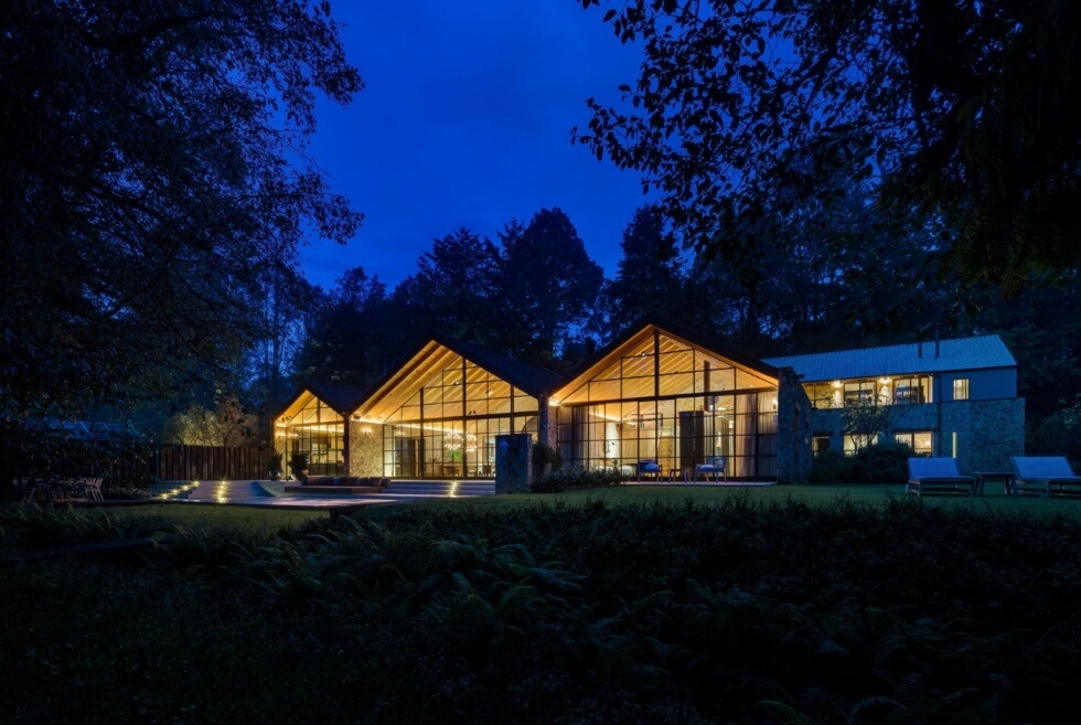
Stone is also moving beyond conventional countertops. A single material can continue from a vanity into a splashback, wrap a console or form the top of a dining table. The effect is strongest when the stone retains its natural variation rather than being surrounded by too many competing finishes. Recent architectural projects demonstrate the same approach. Casa Mezcal in Mexico City combines natural stone with warm timber, steel and bespoke joinery, creating an interior where materiality provides much of the visual interest.
Stone brings weight and permanence into a room. The most successful applications keep that character visible.

For years, pale timber dominated contemporary interiors. The current mood is considerably warmer.
Darker woods such as walnut and richer oak, along with burl and figured veneers, are gaining renewed attention as interiors move towards warmer, more characterful materials. The wider timber industry is also seeing growing interest in wood as a design material that brings natural variation and visual warmth to interiors. The appeal is not simply about colour. Grain, knots, irregularities and patina give timber a sense of history and individuality that a perfectly uniform finish cannot reproduce.

Timber can also perform more than one architectural role. A full-height timber wall can conceal storage, frame a doorway or divide a room. A timber ceiling can bring warmth overhead. A substantial dining table can become the visual anchor of an otherwise restrained interior. The Gentle House in Melbourne provides a useful example. A large timber joinery wall forms part of the architecture, concealing storage while helping organise the kitchen and living areas. Timber, stone and soft textiles create richness without relying on excessive decoration.
Grain is becoming a form of ornament, with material character doing much of the visual work.

Glass has a particularly useful quality in interior design: a wall can exist without completely closing a space.
Fluted, reeded, smoked and textured glass can divide rooms, introduce privacy and manipulate light while preserving a sense of openness. That makes glass particularly useful in apartments, where every square metre matters. Singapore’s 2026 design direction includes more fluted glass alongside warm timber and textured surfaces. The material can also create a gradual transition between spaces. A glass door between a kitchen and living room can close off cooking smells without destroying visual continuity. A ribbed-glass screen can conceal a dressing area while allowing daylight to pass through. Smoked glass can add depth without introducing another opaque wall.

Recent residential projects show how glass can work alongside timber, stone and steel rather than appearing as a standalone feature. Casa Galería in Bolivia, for example, combines wood and glass within a contemporary residential interior. The best glass applications do not simply make a room look larger. They control what is revealed, what is concealed and how light moves through the home.

Metal works differently from stone and timber. A relatively small amount can change the character of an entire room.
The current preference is moving towards brushed brass, bronze, warm nickel and finishes that develop a softer appearance over time. Highly polished chrome is less dominant, while tactile and patinated metals are increasingly used as part of the furniture and architectural language. Tactile metalwork is also a growing direction, which treats metal as a material with texture and personality rather than simply a decorative accent.

The most effective applications are often the smallest. A bronze handle can change a wardrobe’s character. A brushed metal tap can bring warmth to a stone bathroom. A sculptural metal table base can provide contrast against timber. A carefully detailed door frame can make an otherwise ordinary opening feel architectural. Metal also benefits from contrast. Against marble, linen or timber, a warm metal finish feels less industrial and more domestic. Luxury often resides in the details that meet the hand.

Hard surfaces can provide structure, but textiles make an interior feel inhabited. Velvet, linen, wool, mohair, bouclé and woven materials introduce softness, absorb light differently and influence how a room feels acoustically. Rugs, curtains, upholstery and textile wall treatments can also add layers without requiring more furniture.
The current direction extends beyond conventional upholstery, with greater interest in tactile surfaces, woven pieces and textile-based wall treatments that bring texture and a more human quality to interiors. Textiles can also soften spaces dominated by stone, timber or metal. A large rug can visually anchor furniture, while full-height curtains can make a room feel taller and quieter. A textured wall hanging can break up a large blank surface without introducing another hard finish.

ArchDaily’s coverage of Milan Design Week 2026 also highlighted textiles as spatial elements, including a rug collection by Kengo Kuma and Jaipur Rugs that uses gradation, material density, and visual rhythm to shape the atmosphere. A room can look luxurious through expensive materials, but texture makes that luxury more immediate. The hand, not just the eye, becomes part of the experience.

The final elevation may be the least glamorous, but it can be one of the most effective: making storage part of the architecture.
Integrated cabinetry can conceal appliances, books, work equipment, clothing and everyday objects, allowing the main living spaces to remain visually calm. Full-height joinery, flush doors, concealed handles and pocket doors can make storage feel less like furniture and more like part of the building. Current interior reporting also shows growing interest in kitchens that combine fitted storage with freestanding furniture, while concealed pantries and appliance cupboards keep busy areas visually controlled. The Gentle House demonstrates the idea particularly well. Timber joinery divides zones, conceals practical functions, and creates a continuous architectural element through the home.

This approach is particularly relevant to Singapore homes, where limited floor area makes visual order valuable. A wall of cabinetry can contain considerably more than a collection of standalone cupboards while preserving a cleaner sightline. The real luxury is not necessarily more storage. It is less visual noise.
Elevation is about editing, not excess. The most convincing interiors rarely depend on a single spectacular material. Stone needs warmth, timber benefits from contrast, and metal, glass, and textiles add detail, light, and softness. Integrated cabinetry keeps everyday life from overwhelming the architecture.
The direction for the rest of 2026 is clear: character over perfection and material quality over visual excess. Elevating an interior is therefore less about adding and more about making every surface, detail and function count.
For more interior reads, click here.
The post 8 Chic Ways to Elevate an Interior appeared first on LUXUO.