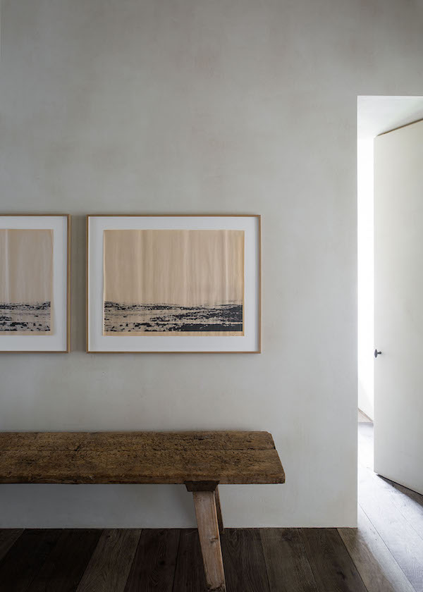
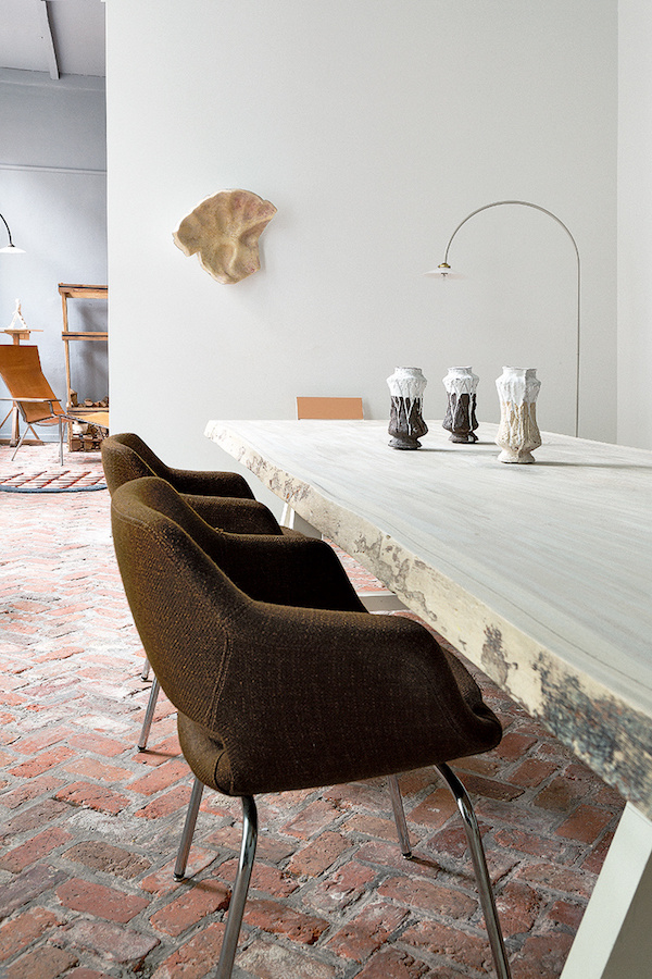
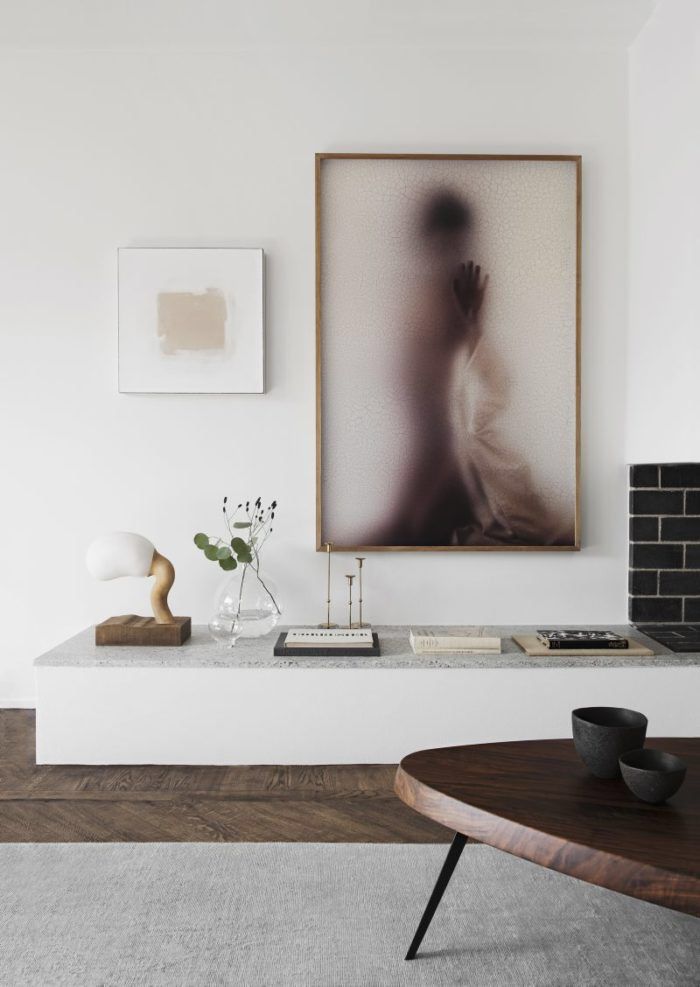
I know big and bold design is on the rise this year, but in the dead of winter something about soothing soft tones calls. I hope the following soft and subtle spaces help get your work week off to a mellow start.

I’m still loving all things velvet, especially pillows in a lush sage tone. I want to just live in this corner until April.

All the yummy creams and lime-washed walls makes me happy.

Just because you want to keep things cool doesn’t mean you can’t use warm color. This entry mixes dusty blues and muted versions of coral and red that just works.

While I love bright white walls, a softer, cool white gives

A deep olive, dusty terra cotta and natural leathers make this space feel mild, but miles from boring.

Large. Unique. Art. Do it!

This mix of browns, grays, cream and just that subtle hint of pink show how you can use color while keeping things subtle.

When in doubt, clean white and beautiful pale wood wins the day.
In our endlessly overstimulating world, I will always fall back on soft and subtle tones to help reset. Do you have a color palette that helps you stay centered?
For more color palette ideas, CLICK HERE.
image 1 / 2 / 3 / 4 / 5 / 6 / 7 / 8
The post Soft and Subtle Color appeared first on Apartment34.
from Apartment34
No comments:
Post a Comment