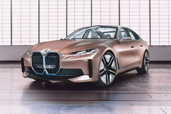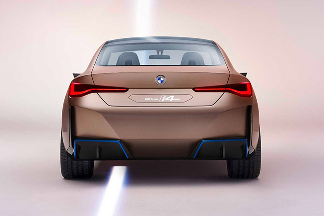
Unveiling its latest logo, alongside an all-new, all-electric four-door BMW Concept i4 Gran Coupe, the Munich-based automaker, presented its iconic roundel design… in 2D.
The Latest BMW Logo is Partially Invisible and Barely Distinguishable

Applicable across a multitude of online and offline platforms, the new logo’s flatter, transparent design not only showcases visual and graphic restraint, but is expected to illuminate on vehicles and in showrooms.
Developed in collaboration with Munich-based studio, BECC Agency, BMW’s newest design has since sparked immense controversy, leaving brand-enthusiasts divided in their judgements.
Stripped down to its most fundamental features, BMW adopts a “less is more” approach, trading its historic black outlines for increased whitespace to create a sense of simplicity and objectivity, whilst refocusing audience attention to the brand’s iconic typography and inversely painted, quartered inner-circle in white and blue.

Expressing hope of expanding its demographic to a younger, more tech-savvy community of consumers who are known to gravitate toward easily identifiable brands and logos – BMW’s Marie Kondo-ed logo, while refreshing, faces the potential risk of camouflaging into clear backgrounds (both online and in print) to the point of a partial-invisibility, barely distinguishable by 2 awkwardly positioned blue quadrants.
Furthermore, at a distance, the new design’s transparent effect makes it harder to parse the logo as a whole – relying on a single inner element, that was once viewed as a whole with its prior black outer ring and BMW lettering, to stand out alone against a variety of backdrops, including on an already white model or on a highway sign pointing towards the brand’s dealership.

While a vast majority of social media users and brand enthusiasts were left wondering why BMW would purposefully make their logo harder to see, not all were resistant to its change – in an interview with CNN Business, Doug Sellers, executive creative director for design firm Siegel+Gale expressed his approval, stating that the new design appeared “more open and accessible” to younger, digitally savvy consumers.
Upon its release, Senior Vice President Customer and Brand, Jens Thiemer, shared his ambitions of equipping BMW with the necessary versatility for communication across all mediums, whilst utilizing the logo as a ubiquitous communication tool to symbolize the brand’s ‘significance and relevance for future mobility and driving pleasure’. Adding that the transparent design gives the car’s exterior colour “even greater prominence.”

Marking the sixth rebrand throughout BMW history – which dates as far back as 1917, to a time when the enterprise was originally established for the sole purpose of engineering aircrafts – the backlash surrounding its transparent logo raises concerns of inauthenticity and distrust, as new and uninformed consumers are offered no hint to the services or products provided, whilst longstanding supporters worry that a symbolic change may result in more drastic changes to the underlying brand – even with the arguably most memorable and nationalistic elements of its logo retained, without substantial knowledge of the BMW brand, its history, past aerospace advertorials and fan-speculated myths, the quadrant “propeller” on its own, appears foreign to the unaccustomed eye.
Despite featuring the ‘revamped’ logo’s integration across all BMW social media platforms, on its website, and on the bronze-hued electric i4 Sedan concept, the automaker has yet to announce further plans to implement the transparent design in its future production of cars… Though based solely on the overwhelming public recoil, they probably shouldn’t.
The post The Latest BMW Logo is Partially Invisible and Barely Distinguishable appeared first on LUXUO.
from LUXUO
No comments:
Post a Comment