Guys, I can hardly believe it, but we’re only one week away from the conclusion of the One Room Challenge and the big reveal of my son’s brand new big-boy room. I have to thank everyone for their recommendations on my curved wall dilemma last week. I think I’ve finalized my solution and design idea and I’m rurl excited about it…but I’m not gonna tell! Not yet anyway. You’re going to have to wait to see the finished product until our finale next week.
For now, I thought I’d update you on the goings-on. Over the past week, I’ve been frantically working to finalize all the details; things like toy storage solutions, all the little design accents and finalizing art and lighting. It’s always a little hard to know when enough is enough, but I think I’m getting close. So today I thought I’d give you a little sneak preview of the final design.
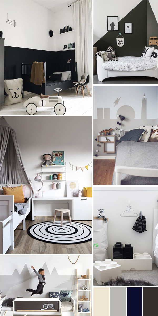
Remember when I described my design vibe as “CA + Scandi, aka California laid-back casual mashed together with a Danish modern edge? Here’s the mood board again to remind you.

Well, I think I’ve zeroed on my vibe… but really, you should tell me if I’m on the right track. Whatta think?

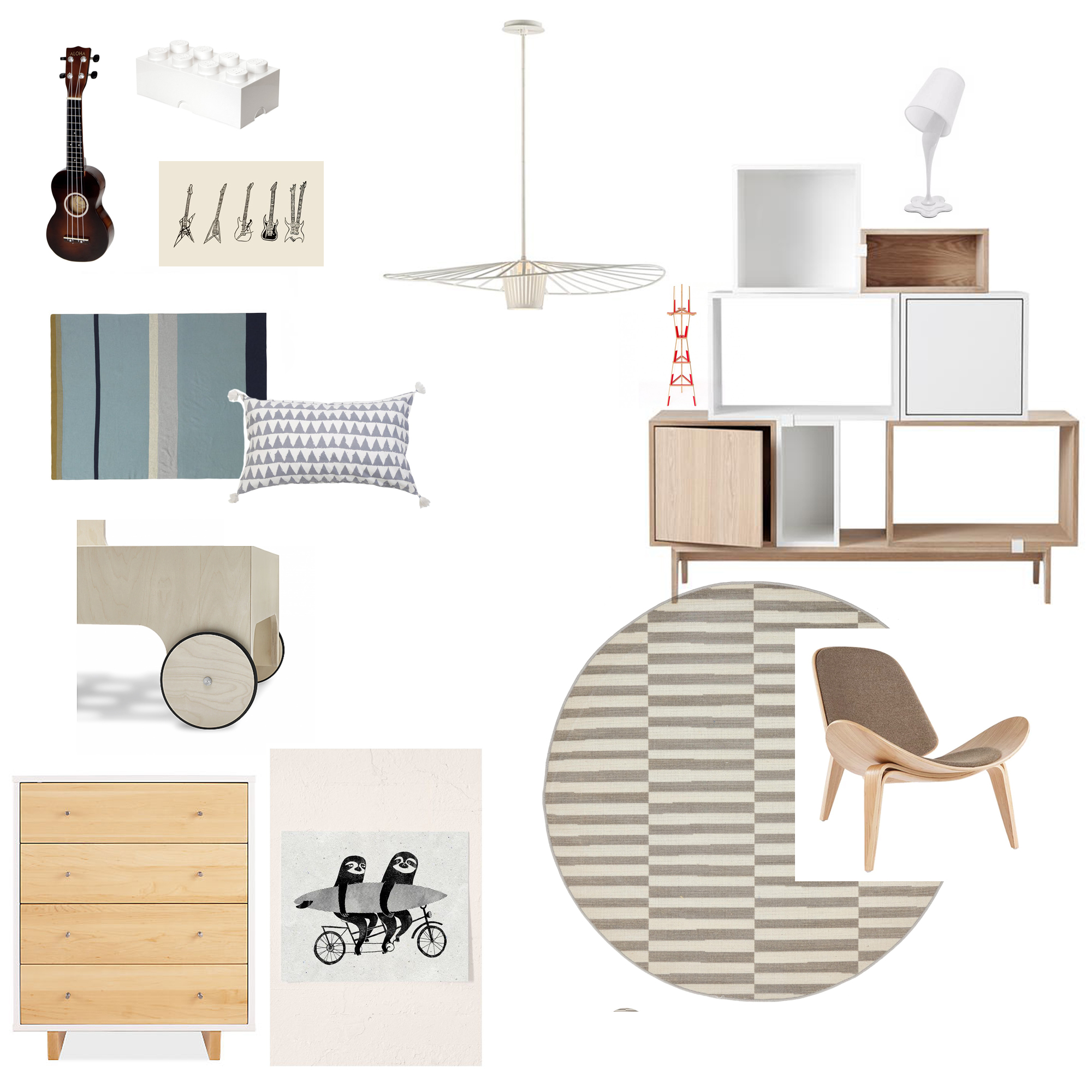
This is my furniture plan! To bring the Scandi feel into the space all of the furniture I selected is made of light woods and features clean lines. Sure, I could have used color in a kid’s room, but I feel like all the white oak will age better. Case in point, the clean, modern dresser from Room & Board. I’d like that to stick around for quite some time.
Our dilapidated glider is finally getting ditched for a modern shell-style chair I found on Overstock. I firmly believe that you don’t need to put kid furniture in a kid’s room but the pieces you do pick should still feel playful. The slim silhouette of the shell-style chair should also open up more space in the room. I’m also ditching the too-big area rug that’s in there now for a smaller round rug in a graphic stripe to add the illusion of even more space. (if you need a reminder of before images, click here).
The lighting in the room is going to get a little upgrade too. I love the Tides pendant from LampsPlus. It’ll accentuate the 11′ ceilings nicely. A cheeky Whoopsy Table Lamp will be a fun discussion point for a three-year-old.
I’m keeping all the art and accessories in muted tones so that all his toys, his art creations, and imagination will bring the color to the space. And of course I have a few surprises up my sleeve as well but you’ll just have to come back next week to see those. For now, I’m frantically painting, assembling, organizing and prepping – all around nap times. Working on a child’s room is much harder to schedule than I realized. Oy. But I’m confident it’s all going to come together beautifully. Well fairly confident (just kidding!). I can’t wait to see the look on my son’s face when he sees the final product.
To catch up on the first four weeks ORC, click the following links Week 1, Week 2, Week 3, Week 4.
Everyone else is probably in the same boat as I am (aka biting their nails wondering how they’re going to get in all done in time!) so be sure to check out their updates below.
ONE ROOM CHALLENGE
Beginning in the Middle | Coco & Jack | The English Room | The Gold Hive
Gray Malin | Jenna Sue Design | Jojotastic | Kelly Rogers Int. | Linda Holt | Marcus Design
Michelle Gage | Natasha Habermann | The Painted House | Rambling Renovators
Sacramento Street | Shannon Claire | Sketch 42 | Stephanie Kraus | Bisou Style
Media Partner House Beautiful | TM by ORC
The post One Room Challenge Week 5: The Final Countdown appeared first on Apartment34.
from Apartment34
No comments:
Post a Comment