I don’t know what is in the water in Australia, but it makes for amazing interior design. I’ve profiled many an Australian designer around here over the years, but I think Alexander & Co might be the ultimate design unicorn. There is not a project of theirs that I do not absolutely adore. This Aussie home, also created by these architecture & design geniuses, was our most popular home tour of 2017.
Today’s tour is a strong contender to top it. Keep scrolling to see why.
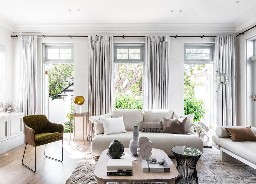
This home is a modern reinvention of a classic Australian Victorian – a task to which I can intimately relate! I can only hope my final results are as cohesive, decidedly modern but also as timeless as this space.
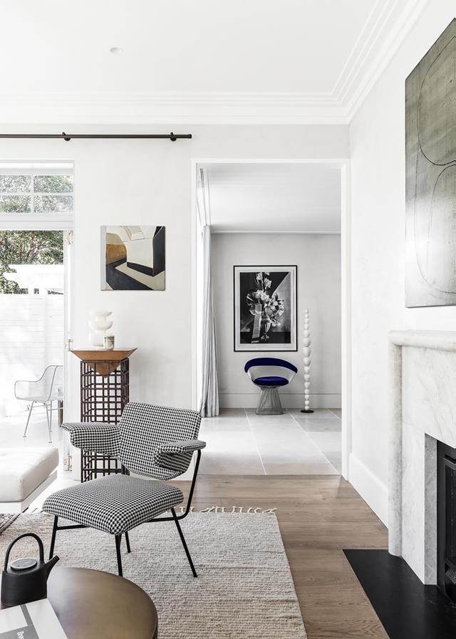
While dotted with many a contemporary design icon (I see you Tom Dixon, Poliform & Knoll) this home’s bones are what really caught my attention.
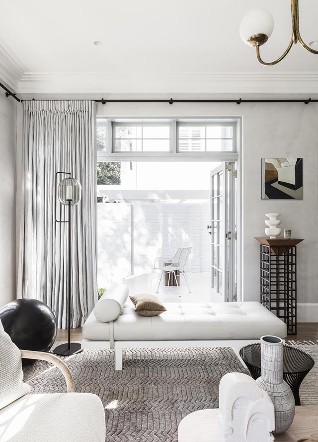
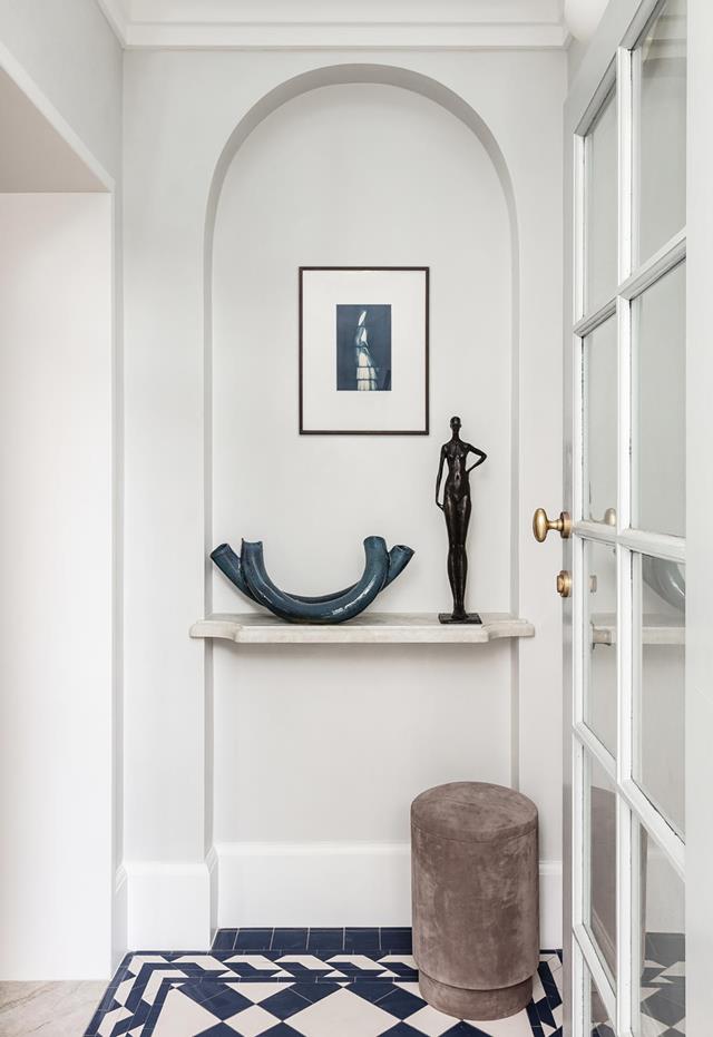
The walls are hand-finished plaster, the millwork is all custom, the hard surfaces – marbles, tile and woods – all work together harmoniously. The attention to detail is beautiful. Transoms above french doors, beautiful built-ins, all the little things that make a space next level are here. No matter how you choose to furnish this house, it is always going to serve as a classically stylish foundation.
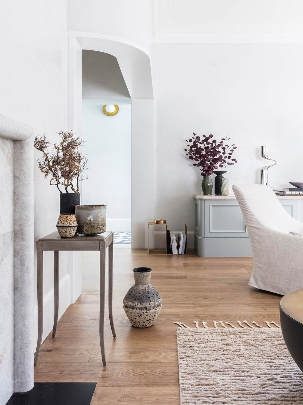
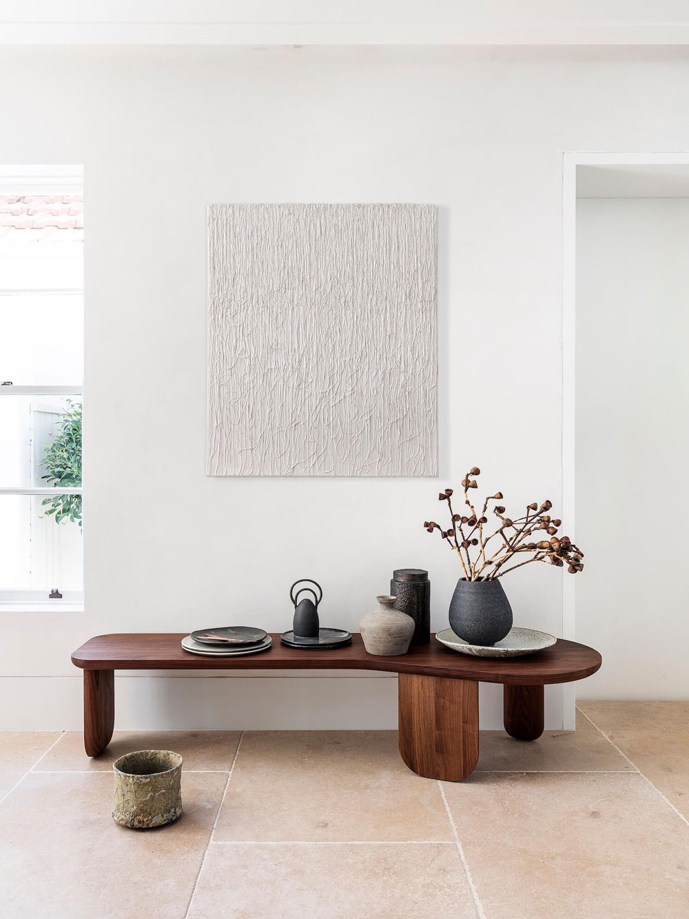
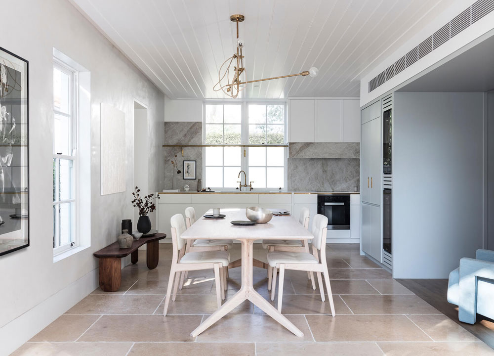
But the furnishing are pretty good too. I’m officially obsessed with this curved bench from Australian design treasure trove Spence & Lyda. Also, handmade ceramics dot many a surface, softening the tone of the home and giving the design a more collected feel. Remember to bring in your texture my friends.
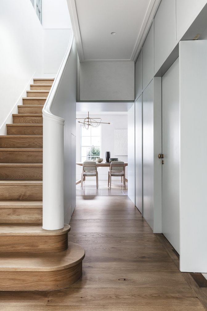
More curves on that stairway. Hello sexy.
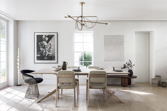
I’ve been seriously considering mix and match chairs for the final design of my dining room and this example is only helping my cause.
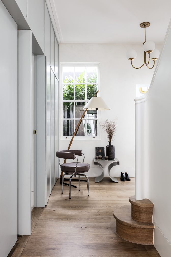
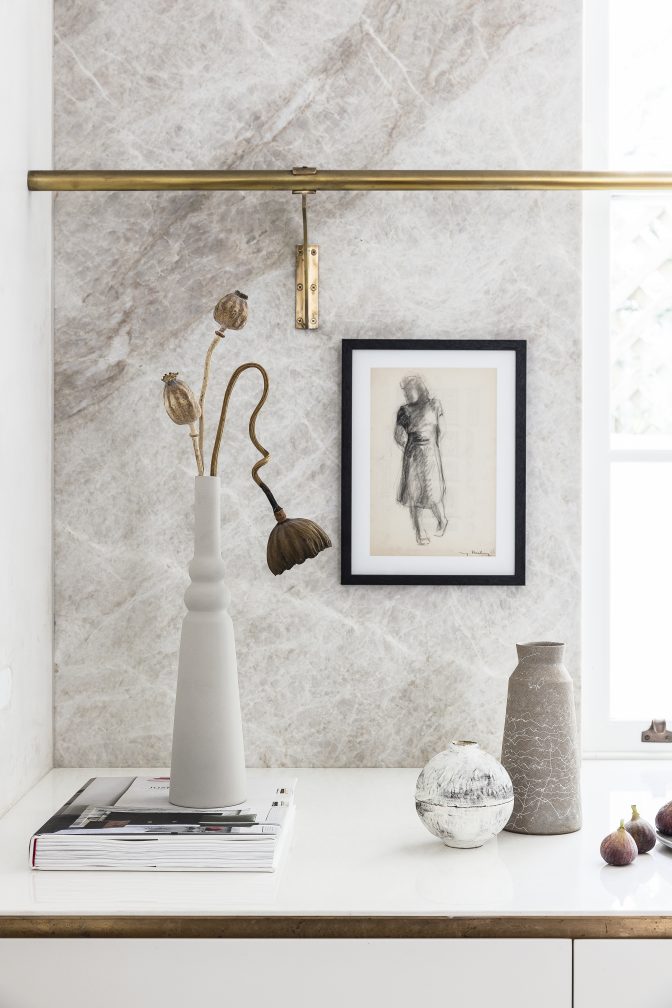
This home is filled with little vignettes of art, ceramics, lighting and accessories that make you want to pause and look more closely. Total #thisoldvictorian goals.
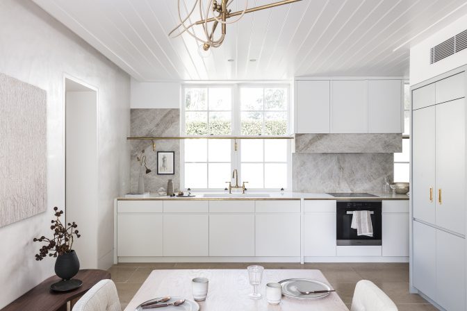
The home’s kitchen & dining area are light and airy but combined, they hold much more interest than your typical all white kitchen. The stone on the kitchen backsplash has incredible movement. Brass accents, including brass trim on the countertops (swoon) has been left unvarnished so it will patina over time. The limestone floors add a warmer tone and wood clad ceiling further softens the space. It all just works.
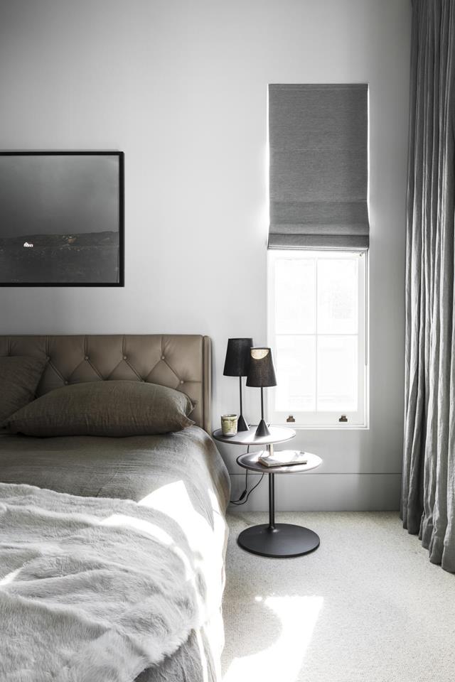
Loving the leather tufted headboard and soft woodsy color palette of the bedroom.
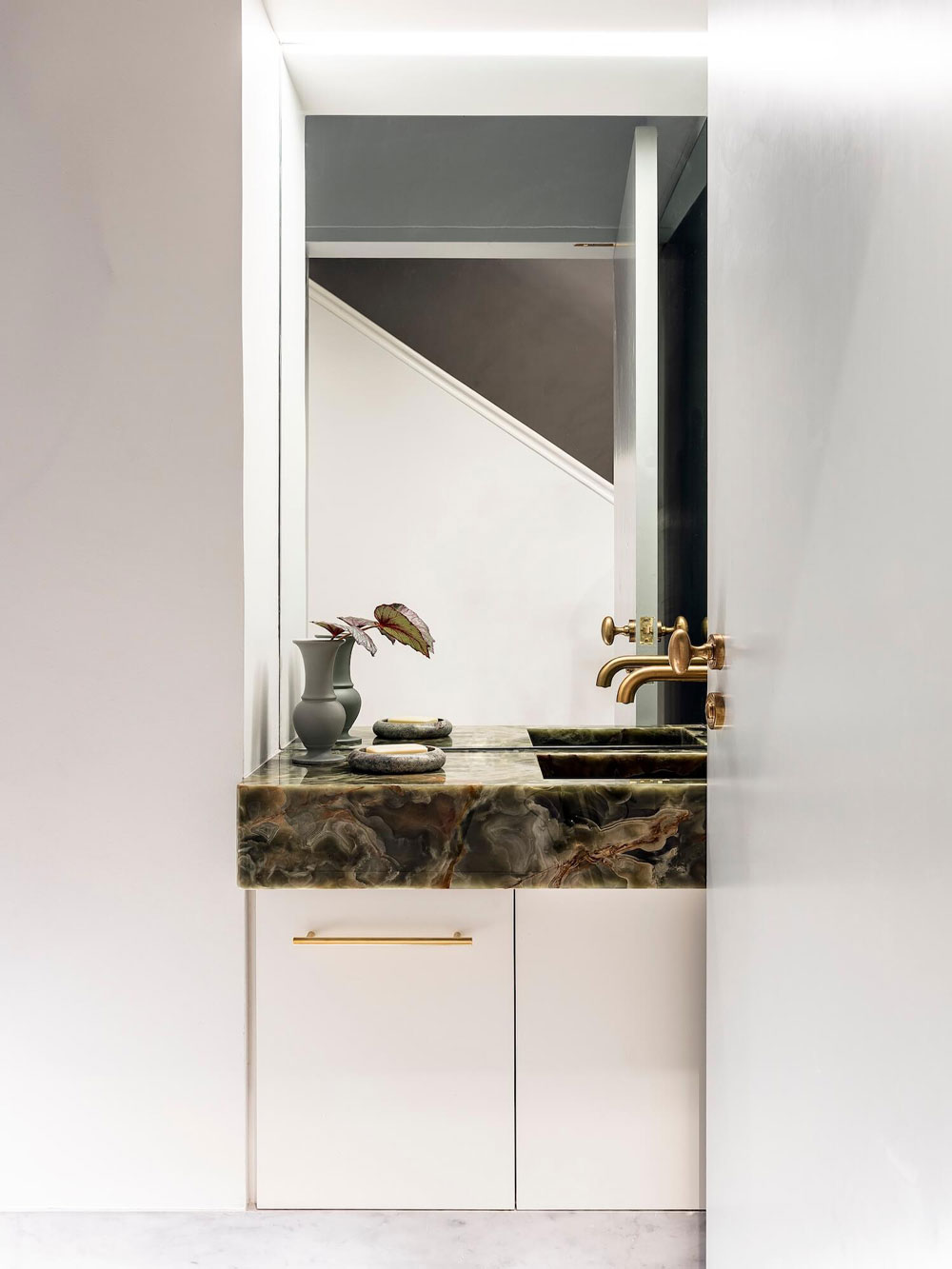
Serious stone goals and also another sideways sink (2019 trend coming on) in a powder room.
This home is reminding me of both the big and little things left to check off my personal design list:
Invest in some seriously beautiful art, ceramics and a really good table lamp or two.
Don’t be afraid to mix and match materials – stones, woods, linen, velvet, brass, bronze, black and a touch of color. When done with restraint and a little bit of balance it all just works beautifully.
Possibly gut my kitchen. Nah…won’t go that far but I am looking for a few more ways to switch things up. This home is going to offer me inspiration for days. I hope it does for you too.
For our home tour archive, CLICK HERE.
design by alexander & co / images via belle magazine
The post Elegant and Elevated in this Aussie Home appeared first on Apartment34.
from Apartment34
No comments:
Post a Comment