Hi friends, happy Monday! Last week you got a little preview of our Sunset Bungalow reveal, so today I wanted to dive into the details of the home’s color transformation. I can’t wait to hear what you think.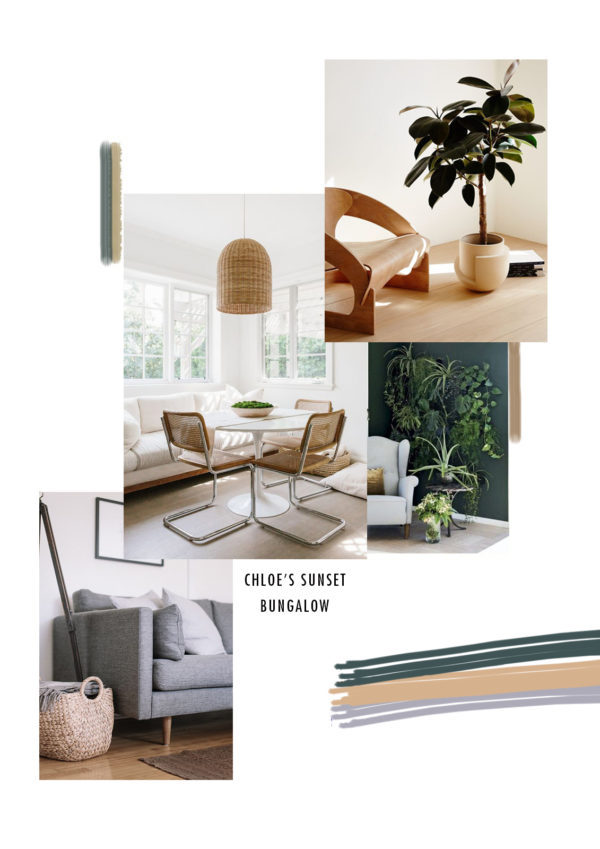
As a reminder, this was our original color palette moodboard. Color is personal to everyone and selecting the right color can greatly impact the mood of a space. I partnered with BEHR to paint Chloe’s San Francisco Bungalow with the BEHR 2018 Color Trends to change the feeling of her home and create a northern California-inspired vibe. I’m a big fan of the BEHR 2018 Color Trends palette and would recommend this collection of unique, new, trend-forward hues to any DIYer looking for color inspiration.
Through a cool mix of color using the BEHR 2018 Color Trends palette, we were able to transform Chloe’s house from dated and dull into a fresh, bright and modern feel, applicable to how people live today. Below are a couple of before shots to give you a better idea of where we started!
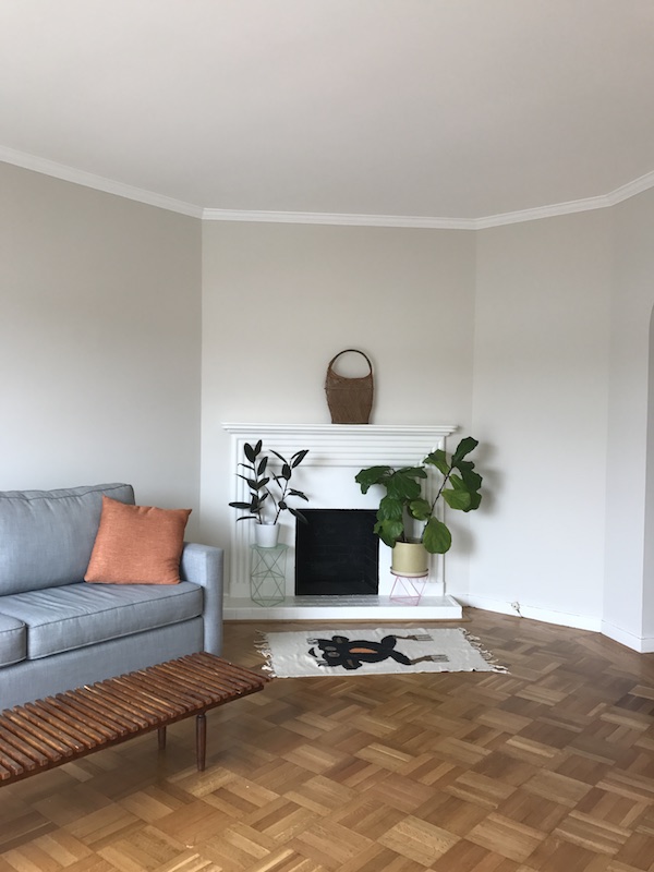
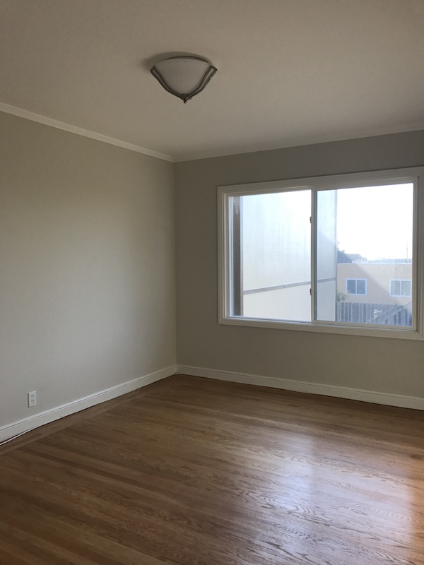
The 1940’s 2-bedroom bungalow is in San Francisco’s iconic Outer Sunset neighborhood, just blocks from the Pacific Ocean. We took our primary color palette inspiration from the home’s beach-side location. We decided to use blue-gray hues in combination with natural wood tones to pay homage to the colors of the sand and sea. But we also added a few unexpected pops of bold color with a deep saturated green reminiscent of the cypress trees that dot the coastline as well as a soft green that reminds us of the wild grasses that cover the sand dunes.
It can often be very foggy in the Outer Sunset so everything else in her home sits against a white backdrop – I wanted to make sure Chloe’s home always felt bright – even when the sun is nowhere to be seen.
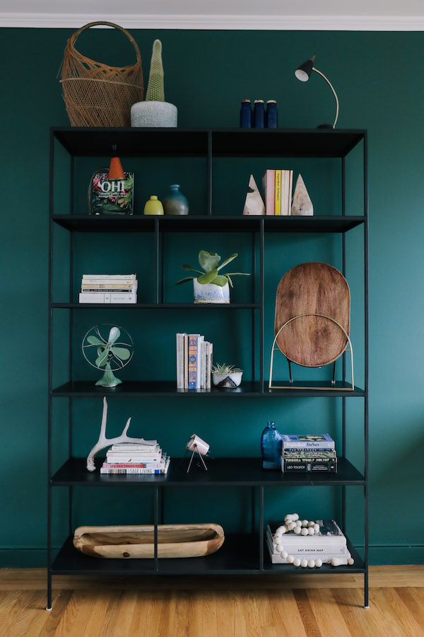
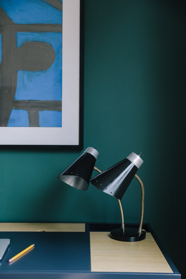
Chloe’s office really shows how you can use deep saturated color in your home. We created an accent wall using BEHR’s 2018 Color Trends Equilibrium T18-20 to ground Chloe’s work area. It’s a rich, warm green that offers deep drama but is still fresh. I’m obsessed.
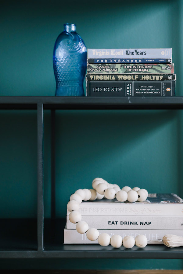
As a freelance social marketer, Chloe works from home, so I really wanted to differentiate her office space from the rest of the house. The dark wall serves as an anchor for the dark shelving unit and desk that we added to the space. The hue also helps Chloe’s display of personal items really pop.
The multi-tiered open shelving unit was the perfect place to house Chloe’s collection of vintage pieces as well as display books by her favorite female authors including her collection of design books written by friends and the works of Virginia Woolf. The bookshelf and desk are accented with warm wood elements to echo the floors and add an organic feel. Succulents potted in pieces from Chloe’s ceramic collection add life.
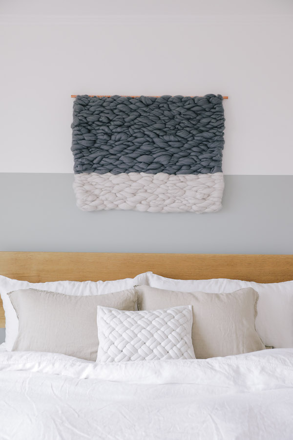
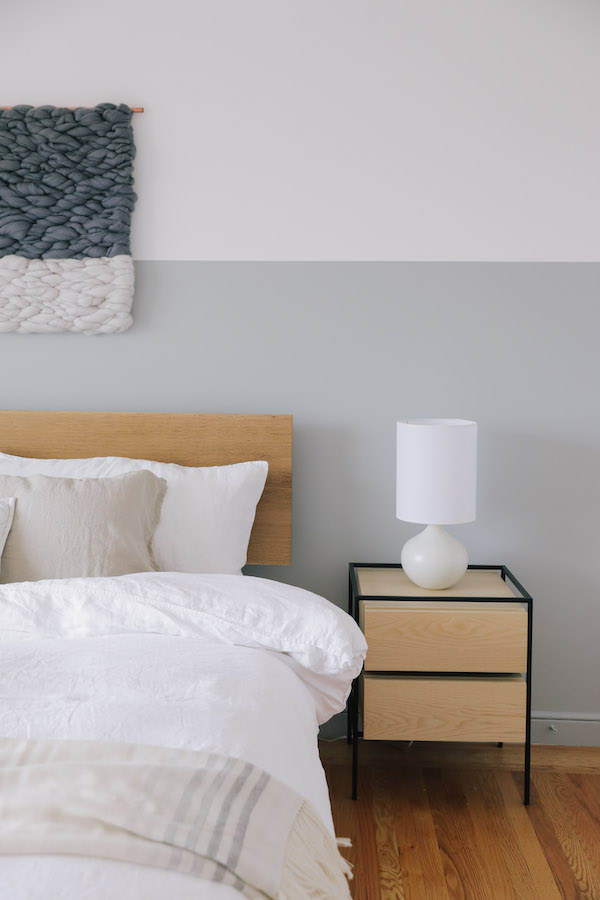
While they share a wall, Chloe’s bedroom couldn’t be a bigger contrast to her office. I wanted to make Chloe’s master a tranquil oasis. The BEHR 2018 Color Trend paint color was a great place to start. Inspired by the ocean, we decided to paint a two-toned wall in the soft light blue-gray – it felt like the sea on a still overcast day. And the BEHR paint color is literally called Quiet Time. Also of note: painting a wall part way up is a little trick if you have a slightly lower ceiling. It helps give the appearance of height.
The bedroom features more natural wood elements including a beautiful custom oak bed made by Bay Area woodworker Ben Winslow. Clean side tables in ash accented in powder coated steel and simple ceramic bedside lamps add to the organic vibe. Linen bedding and a custom cashmere throw add soft organic texture. To further highlight the two-toned feature wall, we had Oakland-based artist Meghan Shimek create a custom weaving that inverted the white and gray. I love how the movement of her piece evokes ocean waves.
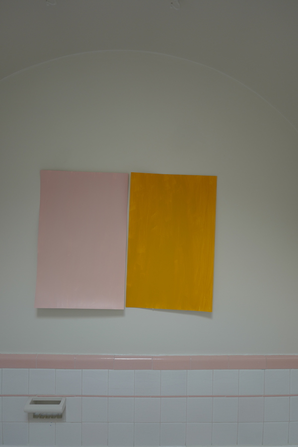
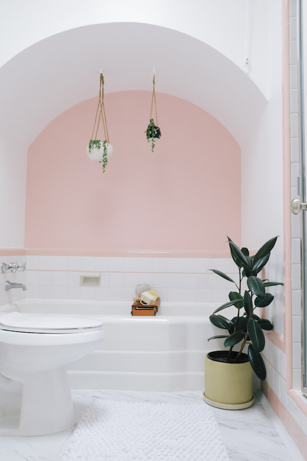
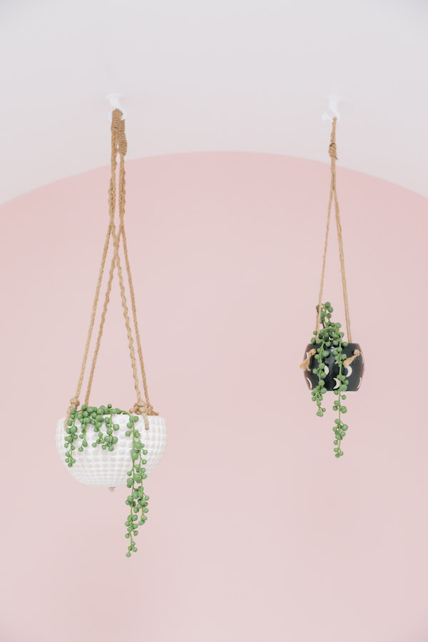
In contrast to the rest of the house, we decided to amp up, rather than tone down, the retro side of Chloe’s bathroom. Her tub features an arched ceiling as well as the original pink and white tile surround, so I thought why not highlight it! While we initially debated what BEHR paint color to use, the BEHR 2018 Color Trends hue Positively Pink was a perfect fit. A few plants in ceramic vases along with a good bath bench add texture and more interest. And now Chloe has a fun respite from her day.
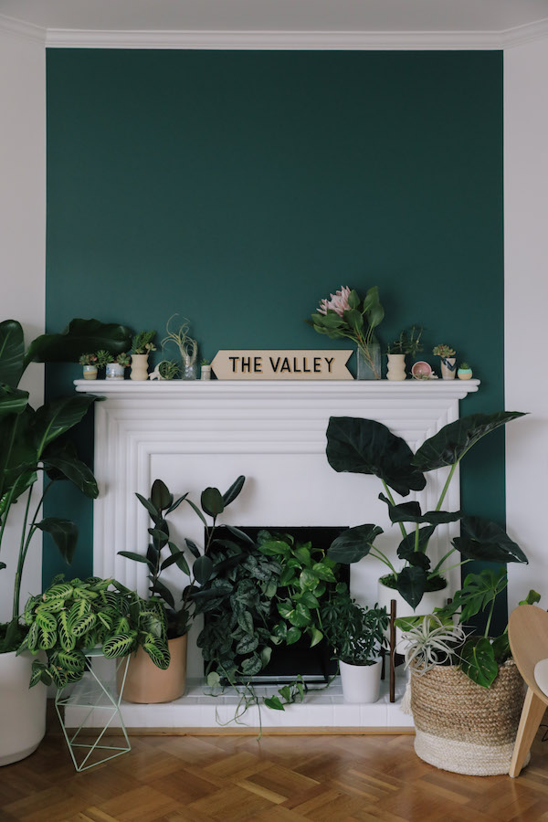
We also decided to play with color in Chloe’s main living space. The art deco fireplace in her living room is one of the home’s original details. The fireplace is no longer functioning so it offered the opportunity to do something purely decorative. Chloe grew up on the island of Kauai and really loves lush greenery so we decided to turn the fireplace into a pseudo-living wall. I pulled in the yummy deep green we used in the office to create a major focal point in this room.
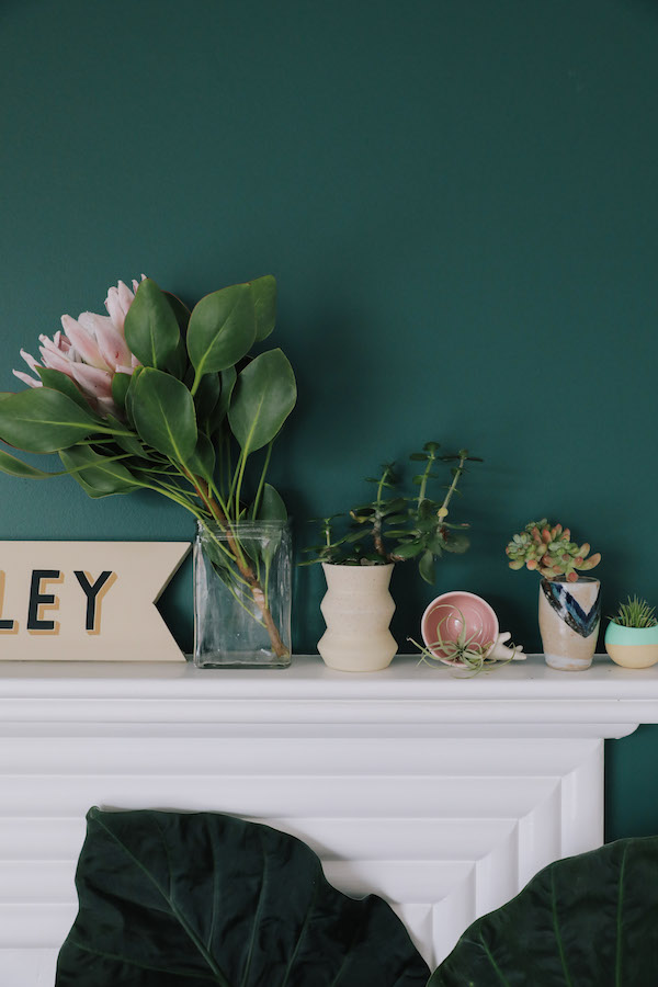
We then layered plants atop that gorgeous green backdrop. Large, small, tropical, desert, we mixed all styles, sizes and looks. For planters, we used a mix of ceramics, metal and even a woven basket to add in a mix of tones and textures.
Succulents and air plants dot the mantel. Chloe can add even more life with hanging or wall mounted plants over time if she chooses! I also love that by pulling BEHR’s 2018 Color Trend Equilibrium T18-20 into the living room, we brought further continuity to the house.
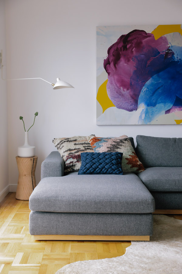
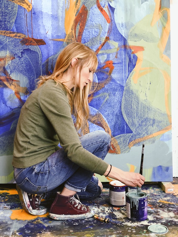
We also decided this room needed an oversized piece of art to anchor Chloe’s couch. A galley wall would have felt too busy with all the action already happening around the fireplace.
Rather than simply find something online, we instead turned to Bay Area artist Nicole Mueller who painted a stunning original piece – using BEHR’s 2018 Color Trend palette! We’re going to be bringing you a complete studio tour with Nicole, but I had to share a little sneak peek of her and her work. Her techniques are so cool. You should definitely give her a follow on Instagram.
Chloe also has a small studio space in her basement that she could use as an Airbnb rental (or as a crash pad for friends!). I wanted to create a really relaxed, beach house vibe for this space. Behr recently introduced its first-ever Color of the Year, In The Moment, a cool and tranquil coalescence of gray-green. While we fell in love with this color, we chose to go with a Wabi Sabi for this room, an easy-going, versatile green, also from Behr’s 2018 Color Trends palette.” In The Moment was the perfect chill color for this room.
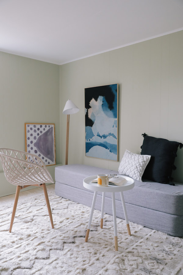
The Wabi-Sabi color pulls in the greens of the trees and the blues of the ocean found in Chloe’s northern-California neighborhood. The fresh, comfortable shade evokes a sense of sanctuary and relaxation amid our busy, always-on lives.
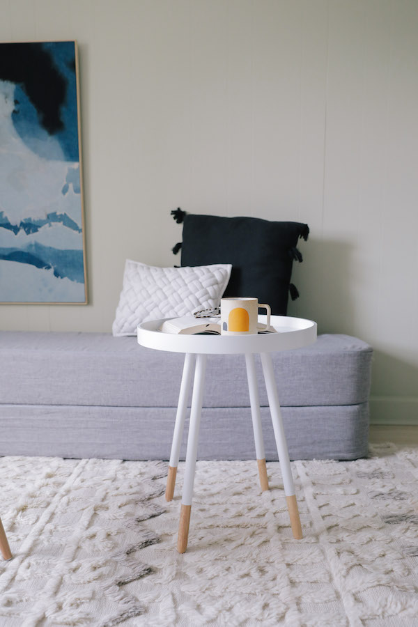
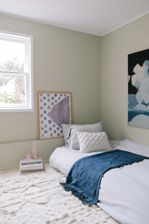
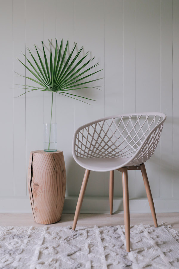
Since the studio is rather small, I turned to multi-functional furniture to optimize space. We found a cool piece the doubles as both an upholstered bench and folds out into a bed. I consider it a modern-day version of a futon – it’s both economical and space saving. This solution allowed us to create a nice seating area where a visitor could enjoy a cup of coffee in the morning and easily create a bed when needed. It was the perfect way to offer a tranquil place to sleep when space is at a premium. Modern, mid-century inspired pieces (from Home Depot no less!), a Moroccan inspired rug and modern art in soft hues add to the laid-back beachy-boho feel. It’s a calm, welcoming spot for a visitor to stay.
So there you have it. You can, in fact, incorporate a variety of color into your home, make it all work together an make it feel like you. I’m thrilled with how Chloe’s paint colors turned out? What do you think?? I’d love to know.
And be sure to stay tuned. We have a lot more reveals coming up.
This post is in partnership with BEHR. All thoughts are 100% my own. Thanks for supporting posts that have kept Apartment 34’s doors open.
original photographer for apartment 34 by andrea posadas creative
The post Home Tour: A Bold Statement in the Sunset Bungalow appeared first on Apartment34.
from Apartment34
No comments:
Post a Comment