This week’s installment of our One Room Challenge update is a bit of a cry for help. Things have been going pretty smoothly thus far. I have my design direction. I found some killer ideas for cool paint features. I’ve zeroed in on my furniture plan (will be sharing next week!). But there is one part of my son’s room that continues to stump me. It is….

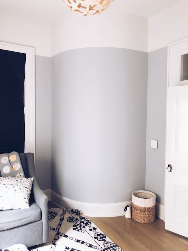
The dreaded curved wall!
You see, my son’s room is basically shaped like a shoe box – except for the right corner – which curves in to accommodate our curved staircase on the other side. (btw, the beat to a pulp three-year-old glider, Home Depot paper blackout shade on the window and that too-big rug are all going buh-bye and I can’t wait).
But back to the curved wall conundrum. I see the options for this thing as follows:
> Paint it – either as a feature or maybe some kind of mural. Bu that feels a little too permanent.
> Wallpaper – this would definitely make it a focal point. But I’m a bit of a wallpaper-phobe. Wallpaper on a curved wall also seems like you’re just askin’ for trouble.
> Decals – Some sort of cool (non-cheesy!) decal to add some adornment
> Simply leave it is is. Maybe it’ll fade into the background with the other features I’m creating in the room. But that seems like a missed opportunity, no?!
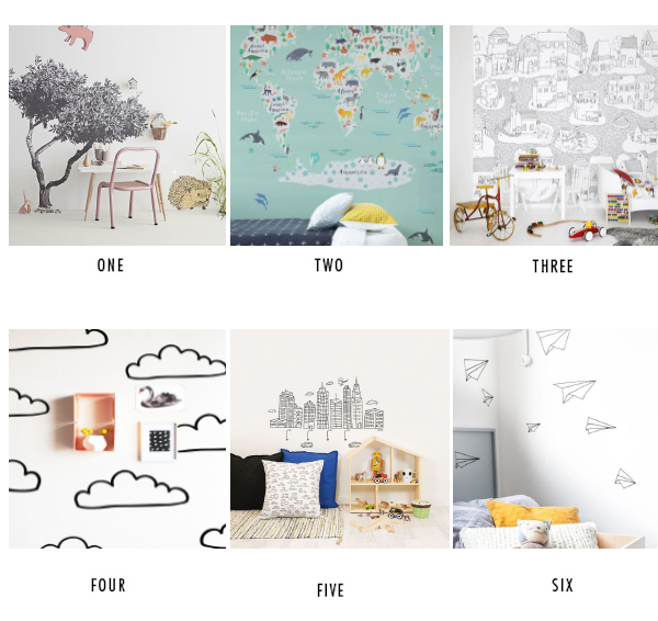
Here are some of the ideas I’ve been considering.

I could do something large scale like a massive tree sticker. But I’m not sure it will age well. What’s cool at three years old just might not cut it at five, six or seven. The world map is cool but I’m afraid all that color and noise would be too overwhelming. Then there are repeating pattern ideas like a series of clouds. It’s a viable option. But clouds feel pretty babyish. I’m kinda into the abstract paper planes moving up the wall, but it also feels rather random and not cohesive with the rest of the room’s design. Le sigh.
I know there are plenty of ideas that would work, they just wouldn’t be the perfect fit. Gah. If you have any creative ideas or amazing sources for a brilliant unforeseen solution, please (please!) send them my way. Cuz I gotta figure something out and real quick!
To catch up on the ORC to date, click HERE for week 1, HERE for week 2 and HERE for week 3.
And be sure to click on the links below to take a look at everyone else’s progress. There are SO many good projects.
ONE ROOM CHALLENGE
Beginning in the Middle | Coco & Jack | The English Room | The Gold Hive
Gray Malin | Jenna Sue Design | Jojotastic | Kelly Rogers Int. | Linda Holt | Marcus Design
Michelle Gage | Natasha Habermann | The Painted House | Rambling Renovators
Sacramento Street | Shannon Claire | Sketch 42 | Stephanie Kraus | Bisou Style
Media Partner House Beautiful | TM by ORC
The post One Room Challenge Week 4: My Conundrum appeared first on Apartment34.
from Apartment34
No comments:
Post a Comment