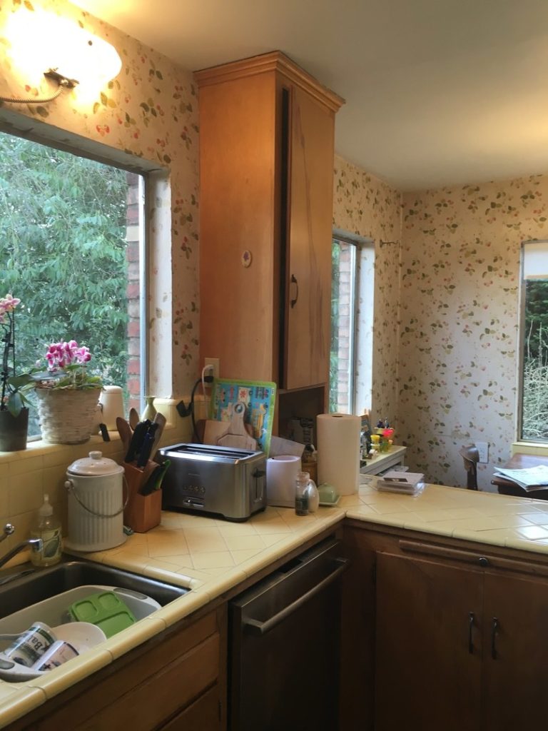
I came across this kitchen on Instagram and it’s definitely one for the future home file. It impressed me even more after I saw the before photos on ArchitecturalDigest.com. Designer Katie Hackworth took the family’s dated kitchen from the 1960’s and brought it into the 21st-century in a beautiful and functional way. The lack of upper cabinets opens up the space and allows for more light. Because I know you’ll ask, the walls are Benjamin Moore Crisp Linen pale green and the upper cabinets in the back are Plantation. For some reason, they don’t give the paint color for the bottom cabinets. I was just having a conversation about brass fixtures with a friend. In this kitchen, they mixed brass cabinet pulls and light fixtures with darker hardware on the windows and pendant fixture, and what looks like a chrome faucet and stainless stove. Somehow it all works together to create a harmonious kitchen that makes me want to renovate mine and will probably make you want to renovate too.


from Habitually Chic®
No comments:
Post a Comment